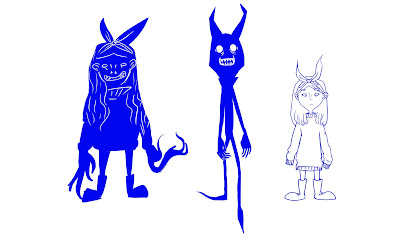
I tried to make both of the characters to have similar features, and tried to make the bow on the girl's head sticks up to resemble the shadow's horns.
 |
| Initial Design |
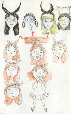
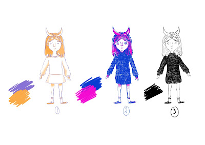
Attempts to follow Tim Burton's style of drawing, but it is too tedious to work on fine lines. So, I decided to not use it. I came up with another design by applying warm colours such as orange and brown on the character, and uses more curved lines. However, it still does not turn out well as it does not give the sinister effect that I want to achieve.
 |
| Attempt on different styles |
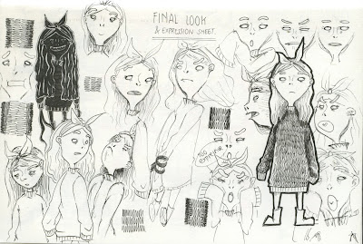
By combining both extremes on the two designs that I did earlier, I came up with a third design which I am happy with. I still uses curved lines, but I made it a little bit more sketchy. I also applied the texture on her sweater. Despite her simple facial features, I am especially pleased with the exggerated facial expression that she can achieve with squash and stretch.
 |
| Final Design |
 |
| Expression Sheets |
Further development on the shadow design. The final design is the one in the middle it has more pointed edges than the initial design.
 |
| Shadow |
The next process is to come up with colour pallettes. I applied different contrasting colours to the character to see how they work. The colours that I use is mainly from the colours of the sky during sunset, but I prefer black and white.
 |
| Colour Pallette |