Overall, I feel satisfied with my submissions for this module. However, there are some things that could have been better such as the research quality of my blogpost, because sometimes I could not be bothered to do these research blogpost that I left it to the end. As a result, I do not get to substantiate my blogpost with critically analysed content, and they tend to be a long list of factual things that I have found on the Internet an books that I read.
Thursday, 17 March 2016
Visual Language Evaluation
We were given different study tasks in this brief for us to get an exposure to the different production processes in the animation industry other than animating, such as character designing, illustrating backgrounds. We are also given the opportunity to do life drawing, in which we grouped together in a group and take turns to pose. I really enjoyed the Visual Language brief because it is segmented into smaller different briefs as compared to the normal big animation briefs. Having a variation of work gives me motivation to keep on doing the task gradually, so that I can move on to do a new task. From this module, I have learnt that I enjoy working on variations of small briefs more than doing a huge chunk of brief. This would be a food for thought when planning my schedule for the new briefs, so that I can properly manage my time, and not get overwhelmed by work near the submission date. I did a lot of first hand experimentation on different drawing media for the Environmental Storytelling briefs, like coffee and ink, paper cutouts, and landscape watercolour painting. I decided to try some of these medium because I got inspired by some of my classmates' work. I am really glad that most of them out well, although it takes a lot of time and effort to get them done. By the end of the module, I observed a growing interest towards the experimental side of animation because I like the idea of pursuing an uncertain outcome.
Environmental Storytelling: Final Drawings
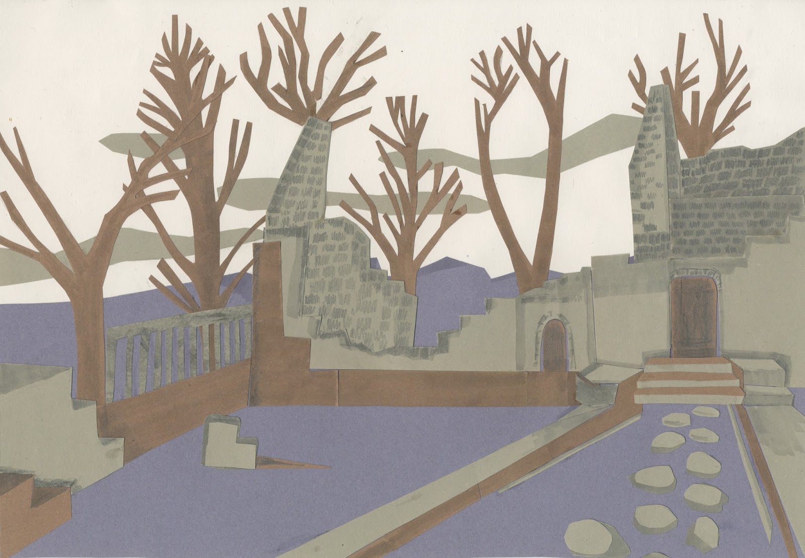
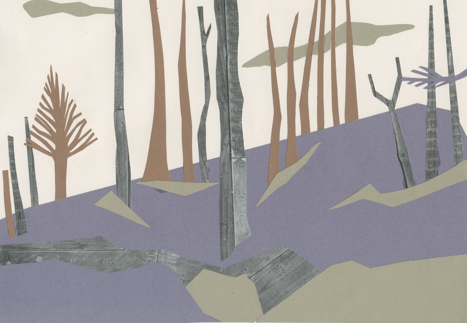
I created thematic set of drawings for my final pieces and arranged them with respect to the themes. The making process involves experimenting with 5 different drawing media: watercolour, digital on Photoshop, coffee and ink, charcoal, and paper cutouts.
Watercolour


Digital on Photoshop


Ink and Coffee


Charcoal


Paper Cutouts

Wednesday, 16 March 2016


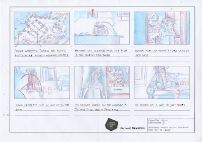
Sequential Imagery: Wear a Helmet
A set of safety campaign posters by Boston University which is aimed for students to wear their helmet when riding their bikes. The wacky design makes a lasting impression of it to the audience, and is an effective reminder for them. There is no order to this set of posters, but the standardised text and imagery allows the people who see the posters to identify them as a set of designs that communicates the same message. They perceive it in such way because, more often than not, people have the habit of stereotyping.


These posters inspires the story idea for my finalised storyboard, such that they are reinforce each other to convey the safety reminder to wear helmet when riding bikes. I decided to go with the idea of a biker chased by a police for not wearing helmet, while adding some comedic element to the plot.


Form, Flow and Force: Prologue by Richard Williams
In The Animator's Survival Kit, Richard Williams stresses the importance for animators to go to life drawing classes as it is a learning platform for animators to study the human figure and motions. According to him, figure drawing is a lifelong learning process that animators must take so that they can create fluid animation or even achieve realism in their animation. Through decades of his career as an animator, Richard Williams has perfected his drawing skill, and realised a childhood dream to create an animation based a story that he had thought of when he was 15. The animation is titled 'Prologue', which is about battle to death between a Spartan and an Athenian warrior. It is drawn frame by frame with realistically rendered pencil drawing. The main focus of the animation is to showcase his expertise in animating through producing sequential drawings of the realistic motion.


Form, Flow, and Force: Joanna Quinn
Smeared pencil drawing is often used by Joanna Quinn, who is an internationally known British Animator who still use the rotoscoping method in her animations. Her hand-drawn distinctive style works well together with her accurate drawings of human figures. As an important figure in the animation industry she actively conducts life drawing workshops in animation festivals, which are held annually around the UK, for enthusiasts who wants to learn more about life drawing for animation.

Quinn also designs characters based on real human beings which demonstrates profound understanding of the human figure. She has taken drawing to the next level with her acute observational skill with her award winning animations which are drawn using smeared pencil drawing. Her talent allows her to achieve a peculiar camera shots by foreshortening the characters which is often used by her to effectively show exaggeration of motions.

Environmental Storytelling: Role of Observational Drawing in Big Hero 6 Production
Walt Disney Animation Studio always strives for enthralling experience in a real world setting, so realism is the most important element in most of their animation. Recently, Walt Disney Company became partners with Marvel, and thus they produced their first superhero movie, Big Hero 6. Big Hero 6 is set in an intricate urban environment made out of a creative fusion between two metropolitan cities, Tokyo and San Francisco. Scott Watanabe, the art director of Big Hero 6, the design of the set in Big Hero 6 is hugely inspired by the background art of futuristic Japanese animation like Tekkonkinkreet, Ghost in the Shell and Akira which are fictional, but still have the realistic look.


To deliver a realistic experience to the audience, the concept artists must be able to visualise correctly the details from the places of reference. A first hand experience, such as going down to the site that they are basing their film on, would help them to scrutinise and assimilate the historical and cultural aspect of the site. As the Hollywood film and animation industry is internationally acclaimed, there is a pressing need to give an accurate depiction of the cultures and history to cater to international audiences. Moreover, observational drawings could be used as better references than photographs for the artists to further develop the set design as they serve as records of the artists' visual response to their experience on the actual set.


Environmental Storytelling: Wes Anderson
When I think about environmental storytelling, Wes Anderson is the first person that comes to my mind. Wes Anderson's theatrical approach to film making involves meticulous props making that is done to perfection even on the slightest details. For instance, during the production of Grand Budapest Hotel, the props team did a lot of reworks before successfully designing the Mendl's cake box, which smoothly opens when its bow is untwined. A well thought set gives quirky aesthetic to Wes Anderson's film, which drives his success as a director.

Wes Anderson also develops a colour palette for each of his films. He is fond of using vintage style colours which are used consistently throughout the film. The use of colour palette gives films or even animations more aesthetic which distinguish them from reality, which adds their value as a leisure entertainment that gives the audience an exciting movie experience.

Environmental Storytelling: Road Trip
An hand drawn animation by Xaver Xylophon which is a character-centred animation which touches the theme of insomnia and depression made interesting by the aesthetic throughout the animation. The washed out textured backgrounds throughout the animation made using pastel on textured paper portrays the restlessness of a person who suffers from insomnia. Therefore, engaging the audience to the theme of dialogues in the film. Some scenes in this animation involves backgrounds shots from various angles, without people in the scenes, which gives this animation the look of an introductory narration in life action films. It is a creative diversion from conventional presentation of narrative-driven animation in, which focuses on character interactions rather than the aesthetic of the film.
Environmental Storytelling: Paul Julian
Looney Tunes backgrounds are minimalist in style, solid, and detailed, which makes them stood out from other modern cartoons backgrounds. Paul Julian is one of the background designer for Looney Tunes who filled the animated cartoon with amazing backgrounds. The most prominent characteristic in Julian's background designs is the 2D flat and bold coloured foreground done in separate cels. It gives contrast to the more toned down background which allows the characters to move around a space. He also uses textures to stylise the backgrounds, and make them look more realistic.

Julian's background designs possess top notch aesthetic quality, yet does not compromises their functionality. For instance, the backgrounds below are extended beyond the screen sizes which enable camera panning, while details in the designs allows the camera to capture realistic shots when it zooms in.


Sunday, 13 March 2016
Form, Flow and Force: Sketching and Drawing is a Performance
Source: Sketching for Animation by Peter Parr
For animators, life drawing is not just about portraying the human figure accurately and understanding their anatomy, bone structure, and muscles through observations, but also about taking into consideration of the continuity of movements of the subject. Parr stressed the importance of details in sequence of actions for an outcome in animation, and to be aware of such details an animator must pay attention and understand 'stage craft, time and spatial awareness'. The bodily actions tends to be expressive, thus to animate well, an animator must have to take into account how emotions can affect movements in the animation to grasp the audience's attention. Early animators uses exaggeration to deliver a balanced and convincing performance. Nowadays, exaggeration is not as apparent in animated films as cutting edge animation software allows animators to make slick and realistic character movement. Nonetheless, it is still important for us, animators, to keep sketches and drawings to account the emotional temperatures of reflection and force to deliver the best 'performance' from our drawings.
For animators, life drawing is not just about portraying the human figure accurately and understanding their anatomy, bone structure, and muscles through observations, but also about taking into consideration of the continuity of movements of the subject. Parr stressed the importance of details in sequence of actions for an outcome in animation, and to be aware of such details an animator must pay attention and understand 'stage craft, time and spatial awareness'. The bodily actions tends to be expressive, thus to animate well, an animator must have to take into account how emotions can affect movements in the animation to grasp the audience's attention. Early animators uses exaggeration to deliver a balanced and convincing performance. Nowadays, exaggeration is not as apparent in animated films as cutting edge animation software allows animators to make slick and realistic character movement. Nonetheless, it is still important for us, animators, to keep sketches and drawings to account the emotional temperatures of reflection and force to deliver the best 'performance' from our drawings.
 |
| Rhythmic Lines by Fred Hatt |
Form, Flow, and Force: My Life Drawing Practise
I started to regularly attend the life drawing session at college with some people on the course this term because I found it therapeutic and it helps me to unwind. It also helps me understand the human figure and movements even better through observation, which helps me to better my animating skill. I'm still struggling to draw an accurate depiction of face, but I've seen improvement on the human proportion in my drawing.
As I become more confident of my drawing, I tried to step out of my comfort zone by drawing my warm up speed sketches without looking at the paper.
The first few drawings often look strange, but as I understood the form of the person that I draw, the following drawings shows more accurate representation of the figure.
Environmental Storytelling: Lilo and Stitch
Despite the overused Ohana quote, Lilo and Stitch remains my favourite Disney film. The reason for that is the watercolour background which suits the Hawaiian setting in the film as watercolour more faint than gouache, so that the atmosphere in the backgrounds seems more relaxed. The background serves as a visual cue to make the story more dramatic. For instance, by giving off the holiday nostalgia feeling to the audience, they can identify the feeling of coming into a new place, getting a culture shock and unwillingly leaving that place when they have to go back to their mundane daily routine as their holiday have ended. Hence, the backgrounds in Lilo and Stitch effectively enables the audience to relate to the dilemma that Stitch is facing throughout the film.


After seeing these wonderful backgrounds I decided to experiment background drawing with watercolour, while keeping in mind the feeling that I want to convey to the audience. In the picture below, I developed a colour palette based on the mystic ambience that I want my painting to have. Sticking to the initial plan of making the woods mystical is hard as I often get the temptation to add some other colours as I painted.

This is the end result of the painting: Still mystical on the foreground, but not so on the background.

Character Design: Shaun the Sheep
Shaun is a world famous cheeky sheep character who is the protagonist of a stop motion cartoon titled Shaun the Sheep. He is an anthropomorphic character, despite not being able to talk in a human language, as he shows more intelligence than the farmer, who is the only human protagonist in the film. Anthropomorphism in the cartoon is used to generate humour in contrast to the initial character design of Shaun which was debuted on an episode of Wallace and Gromit titled 'A Close Shave', in which he also a trouble maker, but stands up on 4 feet.

Another thing that can be taken from the cartoon is the diversity of the character. For instance, other sheep characters in the cartoon have different designs and they act differently, although their characteristics are not as developed as Shaun's. The different traits of the other sheep have more significance in terms of their role in the cartoon rather than just being seen as a same herd. On the other hand, this can help to expand more possibilities for the development of the show. Thus, contributing to its great success.

Friday, 11 March 2016
Character Design: Tips from Practitioners
Source: Character Art Tips
These character design tips come from illustrators that I found on the internet, and I found them essentially the same to what Preston Blair had said, but these tips are not as formulaic as those given by him. Therefore, it encourages artists to creatively use their imagination to make their own character, while helping them to come up with a character that stands out. To start off the designing, grab a sketchbook and try drawing some shapes that comes up in mind.
These character design tips come from illustrators that I found on the internet, and I found them essentially the same to what Preston Blair had said, but these tips are not as formulaic as those given by him. Therefore, it encourages artists to creatively use their imagination to make their own character, while helping them to come up with a character that stands out. To start off the designing, grab a sketchbook and try drawing some shapes that comes up in mind.
Consider Design Boundaries
Some developments are often needed to make a character design, and I found that many practitioners start off by doing some drawing experimentation of the characters once they roughly know how it would be. Such experimentation allow them to explore possibilities, and arrive at the design that they think is most effective. Some drawing experiments usually involves putting some facial features to the extreme positions and drawing them in various sizes. Varying the placement of eyes gives different personalities to the characters. For instance, big eyes implies childlike curiosity, small eyes are more serious, wide distance between eyes implies oddities while the narrow distance between eyes make the character looks comical. There are more possibilities to the outcome, which can be determined by other factors. So, all we have to do is just draw, draw and draw to explore other possibilities to arrive to the final design.
 |
| Different placement of eyes |
Colour Palettes
Colours are important as it affects how people perceive a character, so the artist must make the design effectively communicates the thought that they have for the character. The colour of a character usually brings out the personality, but at some instances, artists also uses this to create an irony by juxtaposing the beliefs generated by stereotypes. Such effects that mislead the audience are commonly used in animation these days to spice up the film by making the plot less straightforward. For example, an old lady who wears pastel coloured outfit can be a vocalist of a rock band.


Believable Characters
Size of head must balance out the rest of the body, even in an extremely odd and awkwardly shaped character, a character that can walk must be able to prop itself up.
 |
| Character Illustration by Gal Shkedi |
Subscribe to:
Comments (Atom)