Thursday 14 December 2017

Extended Crit 2

I have presented my moodboard and setting the visual style. Content wise, I am heavily inspired by Jean Jullien's comical illustration commenting on social issues. The feel I am going for in the film is lighthearted and vibrant visuals, such as paper cutouts and repeated patterns. Stories are mainly driven by ambient sound, sound effects and free form animation.

I haven't got specific idea for the narrative at this point, but I am drawn towards making it based on Singapore because that is when I start to appreciate how food shapes the society.


Feedback from the crit:
  • Tampopo - surreal and bizarre
  • Something grotesque, like close up eating noises.
  • Specify direction of resarch, premise and treatment.
  • Content: obsession, things carried to the extreme that it creates social issue.

Wednesday 29 November 2017

Small Brief 2: Lifting Tower - Production Diary


Roles:
Generally it works out that Galuh does more image making and bits of animating while I contribute ideas to image making, storyboard the sequences and animate but we quite versatile swapping between these specific roles since we know both process of animating and illustrating quite well.

Initial colour palette:
Pink, yellow and white


1. flickering neon matryoshka Jesus

final character design


neon style test
Galuh's cutout 1
Galuh's cutout 2

The face is clearer when the black and white in the outline drawing are inverted.

neon matryoshka animation


2. eating matryoshka Jesus -> Jesus eating turkey

We are not happy with the style test because the profile of the jesus character does not show prominent features of the facade we have designed.

eating style test

We created a simpler design by taking just the head of the character. The triangular outline was a happy accident as we drew construction line while figuring out how Jesus's hair should look like on profile view. It helps us to work more efficiently such that I can do the animation in basic shapes and Galuh can add the details afterwards, and make the drawings consistent.

our updated design
Instead of eating smaller matryoshkas, we changed the animation into a race between two Jesus character eating their turkey drumsticks to make both themes overlap.

jesus eats turkey animation


3. farting turkey

turkey style test

We made a major technical mistake as we only use the warm LED light attached to the rostrum when animating. The resulting image sequences becomes too dark and too reddish. For the december deadline I have tried to do colour corrections on After Effects (wrong software!!).


turkey fart animation

Final piece colour corrected using Premiere:


Lifting Tower: Turkey from Brenda Christie Muliawan on Vimeo.

In the first and second crit Jimmy said the matryoshka Jesus series will work well. However, he emailed us after we have wrapped up the project that we can't use them because of the Greggs christmas ads controversy. We decided not to rush another animation despite this because we have other pressing commitments to do (COP3 and the short film brief).


Wednesday 1 November 2017

Small Brief 2: Lifting Tower - Idea Generation

The brief is to create 5-10 secs christmas themed animation to be screened on the Lifting Tower at Wellington Place, which is one of Leeds' business district. It is suggested to use bright and bold shapes and colours for the animations since the brick wall is quite textured.

I've decided to work with Galuh from illustration who usually works with collage and paper cutout. However this time we take this opportunity to animate with other traditional media (plasticine collage and hand-drawn) to explore different aesthetics since we are meant to keep the ideas straightforward. Our ideas take inspiration from subjects iconic to christmas and create peculiar scenario based on these subjects.

Saturday 28 October 2017

Small Brief 1: Avocado Hippie

Outcome


-----------------


Development

The first idea that came out is a motion graphic telling stories through objects which expressed a cliched gesture of love.

First Idea
Second idea pops out when I was observing the vegetarian fad and its relation to the stereotype of hippie subculture. New fads are trying to make peace and embrace differences while in reality the people on the top (authorities) are taking the piss. So, I have decided to make a satire of this unrequited love where an avocado is singing a song of peace being pooped on by a flying dove.

Storyboard
Avocado Hippie Character Development
Final Character with Colour


Tuesday 16 May 2017

OUAN505 Applied Animation Evaluation

OUAN505 Applied Animation 2
Brenda C Muliawan
Student ID: bm260478


EVALUATION

Animated Documentary is something that I have been looking forward to since the start of the year, and I was full of expectation that I will be doing something rather abstract and involves treatment of sound. However, it did not go as I want it to be, as I ended up doing another character animation again. Despite not going according to plan, the decision is for the best interest of the group and I enjoyed doing the module because I got to get my hands on watercolour animation for the background in our animation, instead of doing the character animation.

For this project, I am in a group of three with Rosie Summers and Tom Hallgarten, who shares the interest towards the theme sustainability. At first, we wanted to do a documentary animation about fracking with an angry tone of voice, however the project shifts after we met globe-trotting storyteller Devi Lockwood who shared a lot of interesting stories about climate change from audio recordings told by people she met during her travel.  Meeting her is only possible because Rosie came up to Devi during a Frack-Free Leeds meeting when Devi gave a presentation about her journey collecting stories and while getting involved in environmental activism through joining campaigns and conferences in different places. We arranged a quick meet up with her the day after her presentation because she is leaving for London, in which we had a chat with Devi about how the idea of collecting stories about climate change and water comes about, the painstaking process to get her ideas funded and about the people that she met when travelling. We are lucky to be able to get in touch with Devi before she left because we found the right person that has a lot of stories to share and is passionate about the storytelling itself. While waiting for Devi’s audio recording, we still carried our research on fracking and went to Knostrop waste treatment centre to observe the environmental implication of the fracking waste in its surrounding. Although we proceeded with Devi’s story in the end, the walk to Knostrop is not for nothing. It helps us to understand the pressing need to make the public aware about the environmental issue and the bigger of sustainability.

We selected Noelline's story over the others because the personal narrative stood out from many potential topics that we can explore in our animation. We chose to take a straightforward approach in narrative storytelling using characters that the audience can relate to, and this is where the choice of media plays its part. We had decided to incorporate traditional watercolour aesthetic into our animation because of its organic outcome, yet this raises another ethical issue as the process of hand-painting the animation would use up a lot of paper and it contradicts the idea of being sustainable. After consulting some of the tutors, they suggested us to try out the Kyle Watercolour Brushes on Photoshop. We raised this concern during the first crit, and my classmates are supportive towards the hybrid style we want to use. Although it seems contradictory to the hand-crafted look I am after, I have to compromise in the end because the hybrid method is definitely more feasible than just doing everything traditionally.  I helped Rosie to do tests on the backgrounds, and try to blend in the Kyle Brush texture into the traditional watercolour background aesthetic, in which I discovered the method of colouring on top of block white layer. Although there is a disparity between these two styles, the painting technique that Rosie and I discovered works well as a whole.

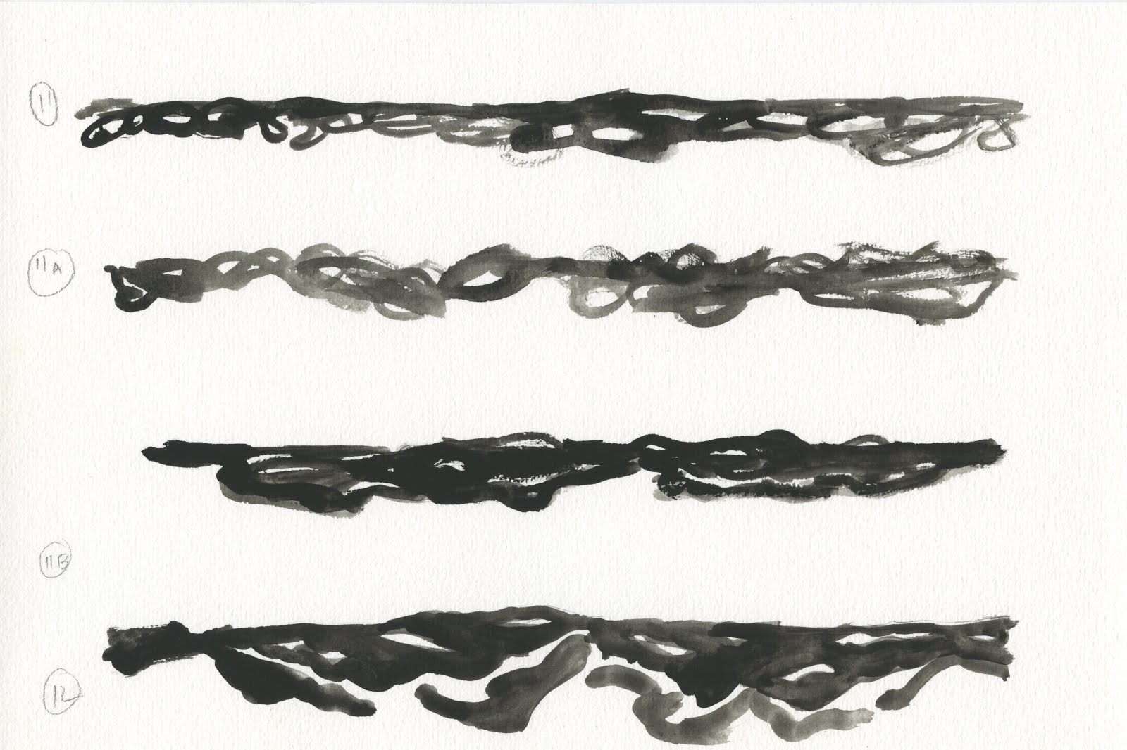
The moment that I enjoyed the most in this project is when I am painting the animated backgrounds because the process is therapeutic. Tom had raised a good point - after looking at my experimentation in the thumbnails I made in my sketchbook - by telling me to keep the background painting and the water animation slightly abstract. My method of using big brushes allows me to create characteristic brush strokes. What I did most of the time is trying to imagine the different energy of the water. The strokes produced depends on my mood at a certain point of time, and therefore, if I start doing a water animation I cannot stop until it is done. I feel satisfied with the degree of clarity of self-expression that I have achieved when painting this water.

I faced challenges in this project in which I have to compromise a lot in when it comes to conceptual ideas because I am working with a bigger group as compared to what I used to in the previous Character and Narrative module. Things did not go as well as I expected it to be, and I cannot really say that I am passionate of the work that I did on this project because I maintained a passive stance from the start. I did not feel that I learnt anything significant by the end of the project new aside for painting the watercolour animation. Despite not being passionate in the working aspect, I am definitely proud by the outcome. The final animation really reflects the power of our team and our passion towards the sustainability issue. We have realised the idea by working based on our strengths and has successfully made an animation that brings out the realism out of Noelline's recount, which can serve as an art that leads people into discussion and hopefully can affect social, economical, ethical and environmental aspect in the world. Our submission to the Leeds College of Art Sustainability Award has reflected our believe in this animation that it has the potential to inspire artists to come up with projects that revolves around sustainability and environmental issue. Overall, this 16 weeks of collaboration with Tom and Rosie have been a great one. We managed to persevere through the tasking process of making a 2-minute documentary animation and stay together as a team until the end. Ultimately, we have successfully create an animation that gets across Noelline's recount on the  destructive nature of flood through emotive storytelling. Looking at what Devi does and by doing this project has motivated me to carry on tackling the issue of sustainability and climate change, and I hope that this will continue to inspire me to try my best to be good for the mother nature in any sort of way.


Documentary Animation: Research - Documentary Animations that I Like


A documentary about Yuko who is obsessed about strawberries. I like it because Yuko's daughter who directed the film successfully portrays Yuko's quirky strawberry fettish. The crayon animation also helps to illustrate Yuko's imaginative ideas about strawberries and makes it more entertaining to the audience. The documentary is not just comedic, but also informative about the Japanese's vice of everyday objects fetishism.

The Chaperone 3D is humorous adaptation of a personal story of a serious incident which a motor gang break into a school dance. The story was told in a first person perspective by a school teacher who are chaperoning during the incident. I noticed that a lot of documentary animation uses mixed media to highlight the mood in the story, and they were used interestingly in The Chaperone 3D to emphasise emotion that is lacking from the rotoscoped movements. The choice of retro aesthetic such as Piñata explosions and puppets animation fits in well with the tone of voice the director wants to convey. It gives off a celebratory feeling towards their victory and manages to recreate an atmosphere which is the opposite of the catastrophic result of the incident. 


INNERVIEWS from Chen Winner on Vimeo.

The animation takes bits and bobs from interviews of famous artists from the beatnik generation. The visual of the animation is minimalistic and attractive. It heavily relies on the print textures, yet it does not deters it to explain the rather abstract ideas introduced in the narration. 

Documentary Animation: Week 15 - Press Pack

Documentary Animation: Week 15 - Printed Pitch Bible

Documentary Animation - Week 15: Submission for LCA Sustainability Award and DVD Cover

LCA Sustainability Award

Tom, Rosie and I have intended to submit 'Noelline's Flood' into LCA Sustainability Award and some other festivals as encouraged by other tutors. We want to bring Noelline's story to inspire artists and also festival goers to have awareness on the issue of sustainability through the perspective of a flood victim. Here is our statement for the LCA Sustainability Award that we made together:


Submission E-Mail below:


As you can see from the emails I made an amateurish mistake during the submission by not making sure that the video has been converted before submitting and forgetting to submit the statement. It was a rushed submission. Luckily, Elli, who manages the submission for this Award, has been really nice to us and remind me to send a follow up email attaching the statement. We got by because it was an internal competition, but I will be more careful next time.


DVD Cover

While Rosie and Tom are doing the final compositing, I prepared for the LCA Sustainability Award submission and also designed the DVD Cover. I did a rough design that I showed to Rosie, but she does not seem pleased with the arrangement, and she told me that she imagined the DVD cover to be similar to children's book cover because our target audience is people from all age groups that are interested in environmental causes. Therefore, we thought of making it to be more attractive in children's eyes.

Rough 1 won't do. It looks segmented, and not interesting enough to grab the attention of the audience. I figure that the vignette border looks jarring in this design, and so I decided to start over.
Rough 1

The image below is the new roughs that I developed after looking at children's story book cover. I like the idea of incorporating the wavy water into the design because the story itself is about flooding. We liked the design with the beach wave as the front cover and Noelline looking down from the boat as the back cover. There is a continuity in the design, and it does not rely on displaying stills from the film because the composition itself is already balanced.

Other roughs

Inspirations from Pinterests and design considerations:

I feel that the blue colour of water is a good material to fill up the space in a book cover design. Furthermore, we have a lot of nicely textured water assets that we can use to make the cover more interesting. Both book cover designs that attracts me because the colour blue is mysterious, and it draws people's attention with a call for adventure to explore the unknown. The composition of these book covers also enhances this persuasiveness, which I want to consider in the DVD cover design.


Final Outcome

The final outcome is similar to what I expected it to be earlier, and I am pleased with the outcome. I followed the initial plan to take some still frames and edit them in order to fit into the composition that I have designed earlier. The idea of a DVD cover is as a still image that can represent the whole story without giving any spoiler, just like making a book cover. After responding to the Penguin Random House Award for Responsive Module, assembling the composition across the cover spread becomes more natural to me. I focused on using big material images to fill up the page instead of using small pieces like what I did for Rough 1.

Final DVD cover design


Documentary Animation: Week 14: Remaining Water, Colouring and Compositing

Water Animation

I am wrapping up painting the water animation this week. I did the remaining waters that I missed out and the beach wave mask. 

shore water
calm water


I found a better method of painting the beach wave using mask. It saves up a lot of paper and time. I can squeeze in 4 short waves into the paper, while longer ones only takes half of the horizontal A4 page. Using the same blue water background animation while applying mask to it makes the transition of the first scenes smooth. However, I need to do a better job in cleaning up the mask in Photoshop before exporting it as a PNG sequence. This time Tom helped me out by thoroughly clean up on the image sequence using Lasso.  In the future, I have to take note that the Colour Range selection tool is not effective in cleaning up textured papers because the textures' shadow is darker than the colour of the actual paper, leaving some of the grains behind.


mask for beach waves


Colouring and Compositing

We aimed to finish up colouring this week, and we managed to do it! I painted most of the things that have not got a fixed colour palette, such as the furniture scene and the salmon fish, because of my role to determine which colour to use during the pre-production stage. I also asked for my group's opinion about the colours that I am using before I started painting the rest of the frames. The choice of colours are informed by Tom's storyboard and the character colour sheet that Rosie has made, which makes the decision-making more straightforward for me.


Final Crit

In the final crit this week, we presented what we have got for our animation so far. We are pleased with people's response to the animation although we have several tweaks to do. For the background, Dan raised a good point about adding things that can make the station more obvious. My team had a discussion about it, and we decided that adding a vintage red lights is probably the best solution because the pole is higher than the building, and therefore it can be visible even when the flood has risen up to the roof.

We also have gotten feedback about the rowing animation because the Hero's expression does not show that he is struggling. There is definitely a limitation to the Hero character design because he does not have eyebrows. I did not take into account making an expression sheet, which leads to this problem. Rosie did a good job in solving this problem by drawing the eyes horizontally and making them closer together as he leans back. To add to the suspense, I also played with colour through making the Hero's face redder when he leans back.


Saturday 13 May 2017

Documentary Animation - Week 13: Complex Water Animation

Back to work!

This week I focused on finishing up the rest of the water. I am left with the more complicated water animation to animate. I was reluctant to start immediately on the watercolour paper so I invest more time on planning out using line test for each types of waves that I will be animating in order to not waste more paper than I intend to.


Rough Water Fail Keys


This rough water line test is the first one that I did. I have lost the successful line test because I did not save it after I used it for reference, so what I have left is this ugly keys for the blog. When I was doing the key, I have not fully grasp how the wave moves, and hence the mess. Also the red bit was meant to be a second layer of the water because I intended to make it look 3D instead of flat 2D. However, I decided to ditch the plan because the outcome is already crowded by texture. So, making it a 3D solid will ruin the aesthetic from the texture.


Rising Water

I used a reference video to look at the movement of whirlpool. It was actually not as complicated because it is just water spiralling downwards into a hole. The whirlpool also seems to move in a constant speed as well, so there is not much consideration when it comes to the animation timing.


I did not do a line test for this one, and drew arrows, the axis at which the water spirals downwards and where the water folds. 


I effortlessly made the whirlpool by painting on different frames with watercolour paper makes the effect of swirling water. Despite looking complex, the randomness of the brush strokes on each frames does the magic. Also, having it swirling in a constant speed also makes it easy to animate.

Whirlpool
A line test for the beach wave. I planned to paint it this week, but the library shop was not open, and I can't buy more papers. So before painting, I studied the movements of waves from a reference video, and made a sketchy line test. The idea is to get the feeling of how I should paint it through the line test.


Beach Wave Line Test


Documentary Animation: Week 11 and 12 - just a holiday announcement

I went for a holiday in these two weeks. It was fun, but I did not produce anything related to this project.

Documentary Animation: Week 10 - Painting Animated Water

Before starting, I had a discussion with my applied animation group about the background. We have come into an agreement that the water is the only thing that will be animated from the background because the scenes will be too busy if the whole background moves in a randomly manner. So, that saves a lot of work. I started off with the water puddle because it is small and therefore less intimidating. I also hoped that the result of the painted water will suit the aesthetic of the animation.

Initially, I was quite bothered by the random movements of the watercolour painted puddle animation. However, after I gave a thought about it, the randomness of the water flow makes up the aesthetic of the watercolour style animation. The style is quite different than digital animations coloured using the colour blocking technique in which animators can have more control of the medium. It is also evident in the scenes that Rosie has coloured digitally as the textures are never the same on different painted layers.

I did several tests of the hand-painted watercolour animation to decide the right timing, in which I have decided that doing it in threes are the best way to portray the continuous movement of the water.

Puddles in twos: too fast!!!

Puddles in fours: too slow ...
Puddles in threes: Just right :)

Doing the flood water on threes also works the best because the movement still looks frantic at the right speed. Therefore, the audience can internalise what is going on with the moving animation. The flood in twos is too fast and the stream of water going from left to right is not as clear as the flood animation done in threes.

Flood in twos: too fast!!!

Flood in fours: too slow...

Flood in threes: Just right :)
So, I have decided to do all the waters in threes. Also, I just realised by doing it in threes, it can be distinguished from the character animation happening in the foreground which is done in twos.

shore water
All the water animations above were done using the same process as the still backgrounds. The blue water is done in a more abstract way because it is not part of what Noelline experienced in the context of this story. It is just a visual representation when she explains her fondness of the river and the sea, and so I want to make a different impression to the viewers from the background.


blue water
The wet-on-wet techniques steps I used for the blue water:
  • brush water onto the paper
  • paint with blue watercolour and lift the paper vertically to let the paint seeps 
  • wait until it is half-dried
  • drip more water from the top


Documentary Animation: Week 9 - Painting Still Backgrounds

I painted more backgrounds with big brushes and more water according to the style that I like from the result of last week's experimentation. I made a vignette effect on the backgrounds by leaving space allowance at the edges of the paper. All the backgrounds are made according to the storyboard made by Tom. 

Safety Hill Zoomed out

Safety Hill

Safety Hill Zoomed in

Shore

This one below is a little bit different than the rest because it is a background for a panorama scene when the dingy is spinning into the whirlpool. I did an initial sketch and painted it on 3 watercolour papers. Afterwards, I scanned and edit in Photoshop using the Stamp tool to link them together. The Stamp tool is really helpful to connect the disjointed brush strokes on the edges of the original paintings before they were stitched up together.


Panorama
I'm not so sure about using this one because it looks different than the rest due to the yellow tinge on top of the water. However, if it is used, the yellow tinge might help to signify that the hero is coming to the rescue.
Shore

Station