Friday 25 November 2016

Telling Tales: Week 8 - Animating and Post Production Bits and Bobs

This whole week have been a stepping stone for me as an animation student. I have learnt more than I have ever had in the past months doing this project, hence the long post.


Animating


Before having to read all the rants on the next few paragraphs about my love and hate journey with Maya, I would clarify that, in the end, I enjoyed using Maya for animating and I would like to learn more about its features for other projects, and I am aware of the potential of this software, especially in the developing industry of Virtual Reality entertainment. I don't think I will ended up liking Maya if I were to have any partner other than Dan, who is really passionate about the software, who has done a good job rigging the character, and who has encouraged me to see the good side of Maya.

I started with a dread towards the idea of animating in Maya. I had a horrible experience on my first day of animating as I kept on losing my scene and Maya kept on crashing when I tried to copy some frames. I have lost everything that I produced on that day because of the messy file organisation. I talked to Dan on the next day, expressing my frustration, so we decided to create a naming convention for the scenes and be more careful when replacing and copying files or folders.

Making CGI animation is also a whole different process to what I am comfortable with, hand drawn animation. The process of CGI animation allows the animators to have emotional connections with each of the animated characters they are animating. Unlike in hand drawn animation where you have to redraw the character all over again, CGI animation only uses one modelled character throughout the animating process. 

Being emotionally receptive and being able to translate the emotions into sequential movements comes in handy when creating believable illusions of life in character animation. Hence, in my opinion, the challenge I faced is when I have to animate the Shaman character designed by Dan. I find animating him harder because it is not made by me, and more often than not, when I make characters, they would reflect some of my prominent traits, just like making a carricature of myself. This is when shooting reference videos comes in handy. 

Good example of the use of video reference in the animation process:

Even the most amateurish is acceptable in reference videos as long as it gives information on the series of characteristic movements . This prompts animators to apply basic understanding of the 12 principles to the acting for the animation.


Me and Dan still have a long way to be a better animation actor. We have to exaggerate more and keep in mind of the follow through movements while acting for as the characters. Our videos is not that useful in that term so we have to rely on my imagination to make exaggerate movements and fluid follow through actions.


Dan acting out the Shaman performing a ritual:


My failed attempt to frown like the disgruntled Totsi:


Getting facial expression animation right is the most challenging part of the animating process. Despite having not much controls to move, the process is more complex because there are a lot of considerations in order to make the animation effective.

Some things to keep in mind:
  • Squash and stretch adds more sparks of energy to the character's expression, so they don't move like monotonous automatons.
  • Dynamic sequence of arcs make the movement of the eyebrows more fluid.

Outcome:


After watching the outcome, Matt suggested to zoom in and out the camera to amplify the emotion in the character. It is definitely something that I could not think of since I barely move the camera when making 2D animation.


After adding camera movements:


Post Production Bits and Bobs


Sound recording with Max, who is my voice-acting coach at the same time. We have not finished rendering out the scenes yet, so we recorded the same sound in different lengths. Max voiced out the Shaman, while I am voicing Totsi. Max taught me that it is important to perform necessary gestures in order to get the right energy of the voice.

Max posing like the Shaman and Dan recording the sound


Paint on glass set up made based on research that I did last week. Before animating, the corners of the acrylics needs to be pinned down to the light box so that it won't move during the painting process. Also, lights other than the light box have to be switched off to eliminate shadows.


Camera and acrylic sheet close up

The whole set up

A cheeky picture taken by Dan of screens rendering.


Sunday 20 November 2016

Telling Tales: Week 7 - Research

I didn't do much character and narrative this week because we went to Manchester Animation Festival, but I read some chapters of this book by Keith Osborn.


The book emphasise a lot in exaggeration, mainly to avoid the character moving too realistically, but at the same time make them entertaining. Other than that, a part that intrigued me the most is polishing the animation because last time I only did the stepped tangent animation for Moom's walk cycle. I learn that I need to devote more time to refine the motion in the animation. Polishing takes the same amount of time as each of the process of planning, pose-test and creating breakdowns in order to achieve the quality of animation in feature films. Hence, it roughly gives me an idea of how much time I should spend on polishing up.

A conventional way of refining movement is to make stepped tangent to curve on the graph editor. Osborn identified a major problem of this method: curve overshoot past the value between the keys being set.

Of course, there are many ways to approach same problem as all that matters is what it looks like on camera view. Personally I prefer another method suggested by Ken Duncan to get the animation right from the start by starting off sculpting each frame in the curves from the core of the character, the hips, and move parented controls accordingly to exaggerate movements. This sounds less mathematical, and more straightforward process which also allows room for creativity and tendency to create happy accidents which makes the animation more natural.

Some useful tips to fix recurring problems:

  • To prevent lagging, delete all the keyframe data on a channel if there is no animation on it: Edit > Delete All by Type > Static Channels
  • Euler Filter under Animation Graph Editor: fix crazy rotations (gimbal lock problem) between keys if not working do the pose again from start


Other than that, I also did a little research for the research blogpost and to get the paint on glass animation for elemental effects in the animation. I worked out a simple light box set up for the paint on glass animation and wrote down a bit of planning.


I am still unsure whether this method will work or not, but hopefully, editing the animated outcome on Photoshop can help the elemental effect blend in to the 3D mis-en-scene. I talked to Dan about the issue, and we decided to have two point light source on the fireplace, so that there will be glow and shadow of the characters cast on the scene and probably help the painted animation to blend in.


Research: Paint On Glass Animation

A direct-under-the-camera method of animating such that the animator draw on top on a glass or a perspex sheet, usually in A4 size, with backlighting. There are lots of method out there to setup the back lighting which gives different effects. The simplest set up is to paint on top of a light box, and this is the most feasible technique for my Character and Narrative project because it eliminates shadows, which makes it less time consuming to set the setup.

Simple Paint on Glass Animation Setup with Light Box

The more complex, industry-standard the Multiplane Downshooter technique is good for a single-medium paint on glass animation because it would cast shadows of the top plane to the planes below. However, when 3D and 2D animation are combined together the shadows from the lighting could be problematic as it will not be consistent with the lighting on the 3D animation. A hypothetical solution will be placing a point light source on the fireplace, so that there will be glow and shadow cast on the scene.


The Multiplane Downshooter technique

The paint on glass technique is suitable for straight ahead animation, and good for animating continuously shape-transforming objects. Although time crunch does not allow to make the animation  comparable to the quality of oil paintings, the mark makings produced while manipulating the mis-en-scene high contrast characters and objects is one of the happy accidents that contributes to the unique aesthetic of the technique. In addition, having an image that lingers for a few frames give rise to the peculiar features of rhythm in animations done in this technique allows the audience to study the feature of each images. Tones of the paintings could be varied by spreading the paint thickly and thinly by using brushes or sticks. The challege of this medium is to plan everything out and do all the necessary experimentation before doing the real thing because there is no artwork to go back to if something does not work. Nevertheless, this challenge makes paint on glass a versatile medium that allows tactile manipulation and happy accidents which introduce new possibilities to the outcome. It is a process heavily weighted on creative thinking, problem solving and exploration of new possibilities using technical knowledge.


The video below is an example of paint on glass animations done by Em Cooper:


Sources:

Wednesday 16 November 2016

Telling Tales: Week 6 - Painting UVs

This whole week, our goal is to finish up painting and applying the textures on the props and characters. We have finished everything by the end of the week, and I am pleased with the textured outcome. The details of the textures are retained pretty well even after being scanned, which eliminates one of our major concerns regarding the project. Dan rendered this scene with the Arnold renderer so that the final scene will have good quality of lighting. 

Textured Scene
We print out the UVs on A3 papers and used acrylic paint to paint all textures on A3 watercolour papers. We used light box to make the outlines of the UVs visible when painting on the watercolour paper, and also to avoid having the polygonal edges in the final texture.


I did most of the paintings with the exception of the tent walls, rattle 3, mask, Shaman's head and Shaman's robe which are painted by Dan. I also modelled the wind chimes, and learn how to unwrap the UVs. Unwrapping seems like a complicated process when Dan showed me how to do it. After showing me several times on how to unwrap some parts of the wind chimes, he lets me try to unwrap the UVs and watch me do it. This is the perks of having Dan in the team, he is really patient and hence a good teacher. Also, if I messed up he will come to the rescue. Despite all that, I don't want to take this for granted because I want to fix the problems by myself as much as I can so that I'll take some learning points out of it.

Steps to unfold UVs: (No screenshots because I forgot to do so)
  1. Open the UV Editor
  2. Do the UV mapping of the object
  3. Use UV mode, select a vertex of part of the object to be unfolded, press command + click, choose ' To Shell' to select the whole part of the object and move it onto an empty space
  4.  Select the edges which have to be cut so that the object will unfold nicely. Think of it like deconstructing 3D shape into 2D.
  5. Next, go to Polygon > Cut UV Edges
  6. After that, go back to UV mode, select one of the vertices, command + click on the UV Editor, choose 'To Shell' to select the whole object, and go to Polygon > Unfold (or shortcut shift+click on the UV Editor, then choose Unfold) 


Sunday 13 November 2016

Telling Tales: Week 5 - Props modelling on Maya

I have modelled some of the props for the animation in Maya. Dan taught me to use some of the modelling tools before I started doing it by myself. I am definitely more confident in modelling after he taught me how to do so. 

Most of the time, starting off with a cube makes it easier for modelling most of the objects, and adding more edge loops to the cubes so that it can be deformed using the Lattice Deformer tool.

The one time I used cylinder, when I modelled the bucket, I messed it up. I extruded the bucket inwards, and I ended up with too many edges. I made it almost impossible to unwrap its UV, so Dan ended up making a new model.

Bucket model that I made

Looks fine from the outside, but messed up on the inside
Some learning points:

  • Work in low-polygon and stay organised. 
  • Remembering to delete history before saving the final model. 
  • Changing the function of the wheel button to middle click if necessary. 
  • Thorough check of the model's edges, make sure that they are organised before unwrapping the UV map.

The bear mask was the most challenging to model. I started with a cube, insert 4 more edge loops on each of the dimensions, flatten it, and curve it with the deformer's Bend tool.

Bear Mask

A major problem occurred when Dan wanted to unwrap the UV because the mask had a lump of unruly edges inside. This happened as I accidentally selected the back side of the object multiple of times when marquee selecting and accidentally extruding them will create double edges. This is why it is important to stay organised and to check the model before unwrapping its UV. Some possible modelling tools that can be used to solve this problem: Multi Cut (to make new edges) and Target Weld (to get rid of unnecessary vertices), Bridge (make a face to connect two edges), Extrude (move a face inward or outward)
modelling tools that I am talking about

I learned it the hard way that it is important to get the model right on the first go, hence modelling in Maya requires a high degree of organisational skill and precision is needed so as to avoid problems in the next steps, such as texturing and even animating. 

Unfortunately, another bad thing happened. Because we keep on replacing the project folder without checking the content we lost the file of this second mask and the eagle staff. We decided that we will not bother to make another mask, but luckily I got an image of the mask. It was also nicely modelled, so it is such a shame that we have lost it.

Lost this one


Thursday 3 November 2016

Responsive: In Cold Blood - Penguin Random House Adult Non-Fiction Cover Award

The brief
  • Re-design a cover for In Cold Blood: A True Account of a Multiple Murder and Its Consequences by Truman Capote.
  • Bold, maybe even shocking cover design
  • Design template: B format, 198mm high x 129mm wide, spine width 20mm, incorporating all the penguin branding and all additional elements such as the bar code.

The challenge
  • Striking cover design that is well executed, has an imaginative concept and clearly places the book on its market
  • Consider physical and digital publications
  • Imaginative concept and original interpretation of the brief
  • Strong use of typography
  • (Audience) Appeal to a contemporary readership & show a good understanding of the marketplaces
  • Have a point of difference from the past and current book covers it is competing against

Background information of the book
  • Regarded as the pioneer work in the true crime genre
  • Startling
  • True account of a gruesome crime and a skilfully researched piece of journalism
  • Brilliantly imagined
  • The most gripping of thrillers

The judges
  • John Hamilton - Art Director, Penguin General: specialised in illustration, 'the driving force behind dropping the orange spines from the majority of Penguin fiction', responsible for art-directing Penguin's hardback imprints, Viking, Hamish Hamilton, Michael Joseph, Fig Tree and Penguin Ireland, invited seventy designers, artists and illustrators to create one cover each for Penguin's Seventieth Birthday Campaign.
  • Joanna Prior - Managing Director, Penguin General Books: book cover design and some award-winning marketing campaigns in the marketplace, run Penguin's art committee which curates the typography art at Penguin's offices at 80 Strand, responsible for publishing prize winners and bestsellers (Nick Hornby, Zadie Smith, Anthony Beevor, John le Carre and Colm Toibin)
  • Jim Soddart - Art Director, Penguin Press: Used to design record and CD covers, and also book covers, redesign and rebranding of Penguin Classics, Penguin Modern Classics and Pelican books, designing and art-directing covers for Penguin's Allen Lane hardback imprint the Particular Books imprint and penguin non-fiction paperbacks.

Reason for interest

The movie adaptation from 1967 has made a strong impression on me, and doing this brief will give me a reason to read the book without feeling guilty. The theme of 'gruesome crime' excites me. I also want to find some other things to do rather than just animating, and I think that creating a book cover allows me to distract myself from the rigorous animating process which has gotten into my nerves lately, and get to try out some other method of visually communicating idea. By choosing this brief, I would also have some other benefits as an animator as I will be analysing the storyline and identifying the semiotics of the book, hence giving me the opportunity to develop the profundity of the content of my animation in the future.


Useful pointers

 'The successful imprint combines the best of the huge with the best of the small, the sales and marketing machine of the juggernaut company combined with the boutique (awful word) sensitivity of a small editorial, design and publicity team where the writer and the agent will know everyone involved and the taste and sensibilities of the team.

One of the extraordinary things about publishing - as both the publishers and the bookselling chains become larger and larger - is what a personal business it is. It is driven by personality: the personality of the book itself, the conviction of the editor buying the book, who in turn translates that into advocacy by sales, marketing, publicity and rights departments, which will then be passed on to booksellers or foreign publishers or even film moguls.'

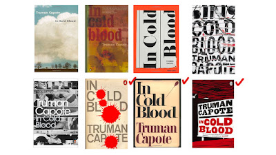
Past cover designs

I placed a red ticks on each of the designs that I like.

First and personal favourite design by S. Neil Fujita

Fujita's artwork is characterised by well-thought shapes, composition and colour, with modern aesthetic. He is well-known for his book cover and record designs. He also does some editorial illustration for magazines. One thing that I like about the book cover is the simplicity of design, the use of colour and the use of symbolic representation which concisely summarised Fujita's personal insight on the narrative.


Cover design by Nathan Burton

Scratchy aesthetic, the use of colour red, black and white gives of the feeling of tension. Has the contemporary look.


Made by the guy who also designed the book cover of the classic Clockwork Orange, David Pelham. The design is spot on with the four blood splatter representing the four murdered victims.

'While I find it quite troubling that such violent events should be narrated so beautifully, nevertheless this is a potent cover that tells the truth, in that judging this book by its cover will not disappoint. It sold extremely well. When considering the cover I noticed that the typographical characters making up the title and author’s name ‘In Cold Blood, Truman Capote’ between them contained four ‘o’s; so obviously I substituted each ‘o’ for a blood spot, one for each of the four victims.'


Wednesday 2 November 2016

Study Task 3: Puppet Master

Pointers from the task summary:
  • Puppet Pin - places controls on your asset.
  • Puppet Overlap - selected areas are appear at the front of the composition.
  • Puppet Starch - selected areas will not distort as much.

After I placed the pins, I tried to mess around with my puppet-self and this happened.

Stretching out in the morning be like...

I put some of the puppet starch on the puppet, but I guess the wonky aesthetic of the puppet tool is inevitable. Initially, I tried to do a running cycle with my puppet, but it is so difficult as the tool distorts the character, and there is no way to put the character back into its initial position unless I am willing to invest more time and get serious on this.

After several tryouts I decided to give up on making my puppet running while trying to get to the other side of the road.
Puppet Starch

Unlike the puppet starch tool, that is hardly useful and sometimes can ruin the form of the puppet, the puppet overlap tool is the real life-saver!

To make it work, simply put pins down on the corners of the mesh while turning on the Mesh visibility. Once pinned, white area will show depending on where the pin is placed, and that is the surface that will be at the front, so when animating a a movement that overlap with other parts of the puppets, the part that is covered in white will be on top of everything else. 

Puppet Overlap

Also, more pins placed, the greater the density of the white area. The whitest the area is the part that will appear on top of everything else in the puppet layer. This is helpful when you are working with puppet that is facing sideways. As you can see from the image below, the pins on the right arm is more dense than those in the body, so when there is an overlapping movement, it will appear on top of the body.

Puppet Overlap

 The final product is nothing to be proud of, but I had a good laugh making this puppet tool animation. I tried to create something similar to the aesthetic of cyriak's animation, who is one of the practitioners who uses puppet tool for his animation. Puppet tool is a fundamental feature of After Effects, pretty straightforward, yet important because it is also the basic of creating a more complicated rig using the DUIK plug in.

Final Piece: (to be replaced when I've put in the audio)


Cyriak's cows & cows & cows: