Thursday 30 March 2017

Documentary Animation: Week 8 - Background Painting

We have moved on from pre-production to production stage now. The task were split such that Tom will finish putting up the pitch bible and Rosie will start doing the keyframes. Meanwhile, I have thought about the background, painted some and do a medium test for some of the backgrounds that I have done so far.

First of all, I tried some puddle tryouts for the simplest background that we have.


I kept in mind what people have raised in the crit,  what I had in mind is a rather abstract background design, with less detail using bigger brushes. I think they will look nice, and I get to do something less controlled and more spontaneous than the backgrounds I have previously painted on the previous concept arts presented at the crit.


Final outcome of the background:


Incorporating the same style of painting to other backgrounds:

I t is quite a challenge to control the intensity of colour I applied on, so some of the backgrounds are a little too vibrant, and I might have to re-do it or edit it on Photoshop.


Test done by putting Noelline together with the background. They blends in quite well. I reduced the opacity of the hills background so that it looks less vibrant. I also put a higher intensity of yellow to Noelline so that the attention is still on her.

They way I work around the problem is to draw Noelline's outline, put a layer below the outline layer, paint it white, lock the layer so that the colour will not go over the white bit that I have painted earlier, and colour in the watercolour bits. I also took a part of the scanned background painting for the watercolour texture for Noelline and change the colour layer into multiply mode. By invert selecting the colour layer, I made a mask on the texture. 


Second test that I did for the puddle. I think this test goes better than the other one. It is probably because of the more diluted colour of the background. To make Noelline blends in I also created her reflection on the puddle by painting with darker shade of blue and yellow.


Thursday 23 March 2017

Responsive: Loopdeloop Chicken - Storyboard and Outcome

Storyboard


I storyboarded my idea, but it seems that having the truck in my animation is going overcomplicate the production process. And it will defeat a simple style that I was aiming for, so I decided to omit the truck scene in the storyboard.


Final Outcome


In the end, I only went to animate my chicken who is cramped up in a box and was about to die. It took me 2 days to animate this, but I really enjoy the process of making it. As compared to my ballerina frog which production I dreaded so much, animating the chicken gives me the opposite effect because I did not take too much time to brainstorm as I only thought about it on the side while doing other animation. At times I like to do something more spontaneous and not forced by the research that I have done is more therapeutic. Moreover, I found that using different ways of mark-making also helps to make the task of animating less daunting. These are the two points that I will take note of when animating because it improves my workflow and get more creative with things.

A good consideration from Collaborative Practice that I applied a lot is to keep in mind that sounds make a significant difference to an animation. An animation can tell a lot more stories if you choose the sound effectively. For instance, I applied buzzing sound of a lorry and the voice of the chicken in the animated outcome instead of animating the establishing scene of the truck and chicken label on it. It might be more fulfilling to get the visuals right, but sometimes sound can simplify and reduce the workload and still get the message across.


Free Range Chicken from Brenda Christie Muliawan on Vimeo.


Proof of Submission

Tuesday 21 March 2017

Collaborative Practice: Week 7 - Animating and Compositing

Deadline is approaching, so we have to speed up the animation process. Some of the animations were done in fours like the parade scene to buy time. It was less smooth than how I wanted it to be, but it was not the most important bit of the animation. Galuh helped me out in making this scene, and I taught her to animate. I am glad that the illustrators I am grouping up with likes to watch films and are familiar with film composition and the golden ratio theory. I don't usually stick to the golden ratio, but I definitely find it handy to plan out the spacing of movements in this cutout animation especially for the parade scene. 


Montage is useful to convey tension for the climax. It was a scary and bloody scene, so the montage of the animal skin needs to move really quickly. The idea is to conceal the animal skin from the audience, so that they can focus on the disgusting bit of the fur coat. I applied this montage technique commonly used by Svankmajer in his films to convey passing of time.
This was actually the most spontaneous and the most fun scene to make. All three of us were responsible of the slashing and exploding the animals. I proposed the idea to the other two girls of live painting, and we all took turns and tried to impersonate Jackson Pollock when making the strokes. It was hella pretentious, but we had fun doing it.


We figure that we can use the shadow puppet in the title and end sequence of the animation. We discovered that we can do so when we were taking a break and Galuh's hand was resting on the set and it cast shadow in the live view on the computer screen.


I like the spontaneity in our group, even when we come up with the title of our animation. Our group dynamics also fit in with the experimental nature of cutouts animation seems like a better choice than if all these are to be animated on After Effects by myself.


Final animation:
I did not do any compositing to the final outcome because I think it will lose its organic feel even with the slightest editing, like adding a bit of vibrancy. There is a beauty in these unedited footages and all the imperfections in the lighting. We did realised the lighting is on the parade scene is not consistent to the rest of the scenes, but when we did realised it was a little too late to re-record the footage again. Although some of my animator friends raised up this problem, we are not too fussed about it. Instead, we liked the dimmer lighting because it foreshadows the dark and twisted climax of our animation.


Documentary Animation: Week 7 - Pitch Bible

I did not do as much work this week because I have to finish up my D&AD animation. We decided to start on the pitch bible and addressing some of the things we need to change from the crit. We planned out the pitch bible's page layout together before we moved on and do our own things. This is what we came up with:

The workload will be distributed equally between us three, such that I will collate most of the character design works that I did and Rosie will do the backgrounds and other concept arts. Tom will do the copywriting, make changes and stitch up the art book together.


On the Tuesday session,  I also did a mock up of the contents page, which outlines what typefaces should we use and the composition in general. Since we are not doing a TV Series pitch, we took a different approach in making our pitch bible. The format that we went with is quite similar to that of an art book for a feature film. I refer to the Boxtrolls' art book from the library for reference. There is nothing new to add for a production art book aside of the drawings that we have done so far and arranging them in a more presentable manner. 


More pages that I did for the pitch bible:


Friday 17 March 2017

Collaborative Practice: Week 6 - Finishing up Assets and Animating

We have finished most of the primary assets and we are ready to start animating the first two scenes. Before I did it with my two other group mates, I did an animation tryout for the first two scenes to get used to the stopmotion cutout animation style. The animating style that I am going for is influenced by Jan Svankmajer's Et Cetera which I had recently watched. So, the puppet's limbs will be cut out into pieces and stuck up together with blue tack to make it move-able. I'd like to show the process of making the puppet of the elephant and the tank, but I forgot to take a picture of them.

I have encountered a major problem with the camera because it gives off this blurry image of the rendered frame, although it looks perfect on the animation mode in Dragon Frame. I asked Tom who have done some cutout animation in the past whether he has ever encountered the same problem before, and he said no. But he helped me to solve the problem by changing the camera's settings. Apparently, the depth of fields in the camera is set to a low number, and he explained that to get a crisper image it has to be set on a higher number. So, I set the depth of field to F 6.3 and got the brightness that I wanted it to be when the shutter speed is at 1/80.

Another problem is that the camera captures what is beyond the preview on the animation mode. However, this was quite a straight forward problem to solve. A day after my first day animating the fireworks scene with a zoomed in preview on animation mode, Alicja figured out that the preview is on 170% which is why the camera is not capturing what is on preview. It was dead simple, but I just think too far sometimes when it comes to softwares!

BIG TROUBLE !!!

Although cut out animation requires a lot of planning, I feel that it requires me to think imaginatively on the spot for the movements as well. More often than not, the plan that was prepared nicely might not always work for the actual thing. For instance, the storyboard that I made barely helped in informing the movements made by the paper cutouts. The fireworks was my first go for cutout animation. The string at the start of the fireworks animation was not planned at all. It was just something that I found laying in the studio and decide to use spontaneously. Another problem was the castle not being big enough for the panning scene and I thought of making parts of the building rise in order to give more space for the castle interior on the next scene. I was intrigued by the process of overcoming the limitation of the cutout medium and working around the problem to make the animation work. I feel more creative doing this than when I do hand-drawn or 3D CGI animation.


I did the next scene with Alicja, although we scraped off the first take of this scene because the room arrangement does not feel right. Our initial plan is to make the queen walk from left to right to come and inspect closely the fur coat. However, making the queen walk takes up more frames that what we have planned for. We rearrange the room so that the queen does not have to approach the two swindlers. Instead, they are the ones who approach the queen and introduce her to the fur coat.

Another question is 'How will the two swindlers put on the queen's coat?'. In normal animation, the big nosed swindler should walk towards the queen and put on the coat onto her. However, it is impossible to do it in a flat animation set because it will ruin the composition at some point when the three characters will overcrowd in the middle of the screen space. So, in order to avoid that, I thought that it will be nice to make the coat just being thrown by the big-nosed guy and perfectly land on the queen's body.


Tuesday 14 March 2017

Documentary Animation: Week 6 - Preparing for Pitch Presentation

We will be preparing for the crit this week, in which I need to finish up the hero character design and do a watercolour background for Rosie's media test. Meanwhile, Tom will be finishing up the animatic.

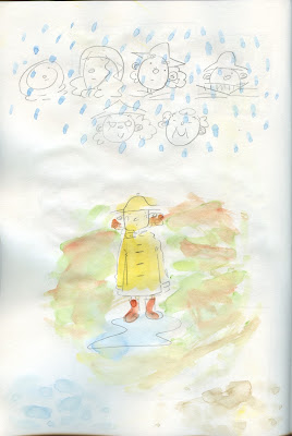
Here is the finalised piece of my hero design. I decided to work outside the colour palette by introducing the colour blue. It does not come randomly since we will be using blue every now and then in our animation. However, I do like the colour blue of the hero because it makes him stood out from the rest of the characters. For instance, having a blue tinge here and there on the hero contrast him from the rest of the characters who are designed with warm colours. It signifies how he is an outsider to the rest of the people who Noelline are familliar with. Meanwhile, the yellow coat enables the viewer to see a special connection between Noelline and the hero who helped her and her family when their house was flooded.


Background I did for Rosie's Noelline line test. It supposed to be a moving background, but we do not have time to put them into Photoshop to make them move before the crit. The design was not planned out nicely either, so I might not use this for the future. I still have to give more thought onto the background because I still put in too much details onto it. I will have to do more experiments until I found the most convenient way to paint it.


Other character concept art for Noelline's Mum, baby and station master that I decided to do because I think I do not put much time into designing them. I have not finalised their colours just yet when I was designing them, so these concept arts will help me set my mind into the colours that I want to use for these characters.


Saturday 11 March 2017

Collaborative Practice: Week 5 - Animatic and Crit and Background

As you can see from the title of this post, we are really overwhelmed from the workload of this collab brief, and I was frustrated because of it. The first half of the week I did not do much things since I am still waiting for the character designs from my illustrator friends. We had a bit of a problem because Alicja seems to deconstruct the king character that Galuh has made instead of just adding bits and bobs onto them like what we has planned originally. We discussed this issue later on, and she explained her point of deconstructing the king and making a new character which is: we are appealing to fur fashion buyers who are mainly women who wants to boast their social status. It was a reasonable one, so we gave the approval to design a queen instead a king.

This problem we had this week with lots of other characters that we have to make adds up to my stress. They made me forgot that I have my own responsibility to make the animatic for the crit, so I panicked on the day of the crit. Luckily, I have Galuh who lend me a helping hand looking for sounds. She found most of it while I did the animatic, so I just need to trim and edit the tracks before putting it into the animatic. 


In the afternoon, we had a crit with Steve with other people who does animation briefs as well. Galuh and I thought we were quite behind, but actually we did alright so far. I was a bit nervous that people won't get the animatic that I just started putting together in the morning session, but it communicates the idea well. I'm glad that our peers liked the characters that Galuh and Alicja have been working on, and the concept of using dark humour with a twist for the cutout animation. We also asked our peers whether the colour palette red, black and white will suit the tone of voice of the animation and most of the people agreed with using the colours to convey violence and bloodbath. They also liked the characters that Alicja and Galuh have designed. Phew... and Kudos to us!!! Still upholding the dream team title.

After the crit, Galuh and I decided to help each other out, and at the end of the day we managed to finish up the 3 main background designs for the castle exterior, interior and the parade in two hours. It seems that I did more than what I have done prior to the crit in just a day. The amount of details in the mono print textures really help to make the background looks more interesting, so we can keep the shapes of the background simple. 

I started to be interested in collage because the making process is like solving a puzzle, but in this I have to think of how the placement of things affect the composition, or even convey meanings behind the choice of objects and their arrangements. It is a quick process as well, and if you do not like something, you can easily move things around unlike if you're making a mistake when drawing.


Wednesday 8 March 2017

Documentary Animation: Week 5 - Other Character Designs and Concept Art

Other Character Designs


Designing the other characters are more straightforward than designing Noelline because their design follows Noelline's. The easiest to design was Noelline's mum and baby. Since they barely appears on the animation, I decided not to think too long for her design. I just designed her to look like a grown up version of Noelline. The baby was just a blob face with a curly hair, wrapped on a blanket.

Noelline's Mum and Baby

As for the station master, I refer to my initial doodles when I first listened to the soundtrack. I feel that Noelline described the station master as a miserable man. He was left alone on the station rooftop waiting to be saved by a hero. My first impression informs the development of his design. The hunched square-faced man was my first attempt to depict the misery in him. He looks too clean at this stage with his shirt tucked in. I do like this design, but I think the outfit is too neat for a miserable character. I attempted other ways to make him look like an abandoned flood victim. I remembered based on my personal experience that people used to roll up their trousers when they walk through muddy waters to keep their trousers dry. So, I drew him with rolled-up trousers and half-untucked clothes.

The station master is the most fun character to design. Instead of drawing him with a miserable face, I drew him with a round glasses. He looks really goofy now, and most importantly memorable. I decided to go with the goofy look since it adds humour, and I think a little bit of humour is not a crime to a story told in a lighthearted way. His final design was the fat chubby man with dirty white polo shirt and rolled up trousers. The mud splattered all over his body was meant to show his struggle to survive the flood.

Station Master
The hero in Noelline's story is a stranger that saved her family to the top of a hill. His image is strong and determined; he saved everyone from the flood by evacuating them to dry areas. Tom has finished the storyboard before I designed the hero character, so I decided to have a look at what he has drawn for research. I like the yellow raincoat worn by him since it makes him stood out when juxtaposed to the rest of the supporting characters and the idea of using darker skin tone. However, I am not sure of using the darker skin tone because there is not much to read regarding history of African migrating to Australia and the native Aboriginal Australian living in harmony with the Anglo-Saxon. If anything the racial prejudice was strong in the 1920s so I'd rather avoid mis-representing them. While thinking for a solution regarding this issue, I thought of some ideas of how the design should look like. Since the hero is a stranger that Noelline has only met once, he should be drawn with a fuzzier line, so instead of pencil, I drew him with a graphite stick to differentiate him from the rest of the characters. Also, his features should be as simple as possible just like a kid's scribble of a smiley face to project a heroic figure that has been translated from a kid's mind.

The hero from Tom's storyboard

Based on my description of what the hero looks like, Tom did some character doodles. He came up with a great idea to conceal his face with scarf, turtleneck or the collar of his raincoat.


With a handful of new ideas, I develop the design of the hero. I tried different outfits such as different types of workwear, hats and caps, but I was drawn towards the raincoat more than any of these outfit. I guess straightforward-ness works with the story we are animating. 

For the hero's face, I want him to not look suspicious. More often than not, we perceive strangers as intimidating predators, which is why I drew a lot of suspicious faces. Noelline and her family would be reluctant to board the dingy if the stranger looks creepy. I experimented with his facial features using different shapes, and got to the rounded face design. 


Hero

The rounded face design looks was inspired by the character in this illustration by Matthew the Horse. I decided to incorporate this into the character because the face looks generic. It is open for interpretation so that it gives room for the audience to use their imagination to project an image of their own heroes. This will keep the audience engagement of the storytelling medium as well by leaving the audience a space to use their imagination.

Matthew the Horse's Illustration

Concept Art

The medium test I did for the flood water was painting loosely with watercolour to create blotchy watercolour textures. I did toned down the colours as compared to the colours on the hero character so the characters does not look too jarring when combined together with the muddy flood water on the background. Tom also suggested the idea of using vignette to convey the idea of how much time has passed since Noelline's flood experience.


Steve suggested us to check out the making of Ernest & Celestine blog. The animated parts of Ernest & Celestine however, does look detached from the still background. For instance, we think the line drawing for the still images and the animated bits are distinguishable, such that it is suggesting what will comes next in the story. We think that the aesthetic of these kind of animation is different from the natural look we are aiming for. We were thinking around the line of using moving textures so that it is not too obvious which things are animated and which are the things that aren't animated to ensure that there is coherence in the aesthetic of our animation.

Another suggestion that Steve gave us is to matte white the animated characters and objects on a different layer after drawing their outline so the texture can be applied on the matte layer hater on through After Effects. I think this idea is better than using watercolour brushes made in Photoshop that look synthetic and less fluid. Other than this, the outline can be animated with Rosie's Photoshop pencil brushes. We think that we can adjust the colour so that outline is not too black, maybe dark greyish. However, I personally think that it depends on how we managed our time in this project. If we are progressing really quick, the watercolour matte that Steve suggested would make the aesthetic better, but if we aren't, the watercolour brush that Matt gave to us should be good enough as well.

Rosie's brush test


Tuesday 7 March 2017

Documentary Animation: Week 4 - Noelline Character Design

Noelline is the protagonist of the story. She was 5 when she had her flood experience. 
With this information, Rosie's storyboard and some other insights that I have got as I listen to the soundtrack, I tried to piece them together and create an image of her in my mind as a part of my primary research. I did play around with Rosie's design as well because I agreed with her that Noelline's voice suggests that she is fluffy and friendly. So, what we want is a cuddly, innocent-looking character. 


The picture above is the initial sketches of Noelline with variations of style. I thought that the look of the animation should be similar to children's book illustration. Since I do not know what specific book to look for, I just typed 'Rain children storybook' and so I found this book called 'It's Raining Said John Twaining' which has a similar style to what I imagined our animation would be. The juxtaposition of bold yellow jacket to the gloomy background makes the characters stand out. Also, the fluid reflection of the people standing communicates the 'wetness' despite the minimalistic background. This book is the main inspiration for the design of our animation. The reason why I want to make an animation that has an aesthetic of children's book is because I want to convey the lightheartedness from Noelline's voice and her delivery of the story.


Excerpt from It's Raining Said John Twaining


This image of a girl chasing a chicken has inspired my design as well. The look is natural and gives off the rural vibes. I tried to find the artist who drew this, but I can't.


For her outfit, I found some vintage Australian kids photos that I found on Google, specifically in the 1920s because that was when the flood happened. The girls wore short sleeved dress most of the time with frills or floral pattern. As for the swimsuit they wear striped vintage swimsuits or a single-coloured one. I tried to match up different designs of Noelline's facial features to the outfit that she wears, and see which one suits her the most. Although the raincoat was the outfit that we think of, I think it will be nice to have her in different kinds of outfit.

1920s kids playing in a flooded area

Reference Image for Noelline's outfits


I showed the designs to Tom and Rosie. Tom liked my attempt to imitate Manon Gauthier's squarish face, while Rosie said that rounded face looks better. As for myself, I would go in between, so Noelline's face is more angular because it is easier to copy a drawing with distinct corners rather than a fully rounded one.


I drew her with different strokes as well because I think if I do my strokes downwards, the drawing seems to be looser than when I do it with upwards strokes. It worked better, the lines I got is less bold than when I use varying strokes. However, I decided not to use this idea because it is hard to control the way we stroke our lines. 
Drawings with downwards strokes and less strong lines

I decided to forsake the mini experiment that I did earlier and keep my strong strokes. I think I found the right face as well now. It was not as squarish as before, and the shapes are not hard to copy as well because of the distinct corners of her face. I kept the big hat that goes with the raincoat because it helps to make her look small.


I discussed the outfit and the character design with Rosie. She liked the vintage dress because it reflects the setting of the story, however she thinks that the yellow raincoat stands out and it fits into the rainy theme better. I do agree with her, on the rainy weather aspects, so I designed Noelline with the raincoat in the end.

As I designed Noelline, I did realised that she talked about a bear stuffed toys, so I did a design for it as well. I am still not sure which design to use, but I liked the snouty nosed design since it works with the flat style we are looking for.