Wednesday 28 February 2018

YCN Brief: Art Fund - Pre Production

Initially, I took the Muybridge's cat walking sequence as a placeholder to test out the flashing frame animation. It came across my mind that to make the animating process more efficient for us, we can use the walking sequence and render them as image sequence so that it can be rotoscoped.

Muybridge cat animation test:


Our main focus is to create different cat illustrations based on 6 iconic art movements:
1. renaissance
2. impressionist
3. cubism
4. constructivism
5. surrealism
6. pop art

We drew straws based on these list, and I've got 2, 3 and 6.

My cat illustrations:
impressionist cat


picasso (cubism) cat
keith harring (pop art) cat

Thursday 22 February 2018

YCN Brief: Art Fund - Idea Generation

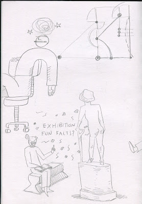
I asked Galuh to jump on board with me again in this project because we get things done swiftly. The project will be a quick one as I need to allocate time on my short film project. Below are some visual brainstorming I did during the idea generation process. My main consideration is the exploring concept of leisure and finding inspiration through common activities in museums and galleries.


First concept:


taking shelter in galleries on rainy days (weak!)


Second concept development:


Reactions when looking at pantings

Looking at interpretation of objects in different art movements and painting styles

create a witty poem about gallery experience that runs sequentially in 6 frames series of A4 collage

drawing objects

Galuh liked my doodle of the people doing figure drawing of cats for a shallow reason that we have been sending cat videos to one another recently. I immediately agreed because the idea is simple, humble and people are addicted to watching cats videos, therefore attention grabbing! We stitched up the other doodle pages into a logical narrative sequence.

Animation title: So Much Feline, So Little Time

The narrative follows a guy who went to an art gallery to draw cats. He came in during the opening hours to study the wide array of cat paintings the gallery has from different art movements. He got engrossed observing them that the paintings of cats starts to walk through the historical timeline of visual art. The sequence is interrupted by the security guard who told him that the museum is about to close. He walked out of the gallery obsessed, and craving for more. The final shot advertises that he can sees more feline for a whole year long with just £5 showing a page of his sketchbook with badly-drawn cats.

Sunday 4 February 2018

Atrocity Exhibition: Style Inspiration and tests

Robert Rauschenberg's and Ray Johnson's collage are the main inspiration for the animation aesthetic. Their works strongly reflect popular culture and current issues at that time through collaged images obtained from printed publications from the 1960s-70s. Therefore, appropriate for an adaptation of The Atrocity Exhibition which are based off Ballard's observation of the media culture in that period.

Our animation will be a video collage in 4:3 TV format consisting of still images and free copyright videos. Each scenes will be in mix media (collage, oil pastels, paper rips, acrylic paints and mono-printed textures, film-scratching), digitally assembled with videos to create a vivid atmospheric experience of the main character going insane due to media saturation.


Robert Rauschenberg

Ray Johnson

Ray Johnson

These are my initial experiments with composition and media taken from separate short narratives in the book.

Some parts of the books has a narrative, thus are better told with a series of sequential images.

We think this one is a bit too busy if it were to be animated.

Waterworld 1

Tom and I liked the use of blue and red in these two. We think this could be the dominant colour for parts of the animation done in acrylic paint.

Waterworld 2

Waterworld 3

I combined an abstract cutout composition with digital collage of images from the internet.

A Mathematical Confusion
I tried to do 3-colour screen print with this illustration to test out the crispness of the half-toned images in the screen printed outcomes. We are quite pleased with the result as it is not too grainy.

(insert screenprint image)

I made the illustrations clearer by creating distinction between foreground and background.
Intersecting Planes


A Scenario of Conceptual Orgasm

Biomorphic Horror