Saturday 21 January 2017

Responsive: Loopdeloop Cute - Colour and Animation

Last week, I have watched several ballet videos from Svetlana Savelieva which is a prestigious ballet academy in Russia. And, I decided to use one of their exam footage as a reference video for my animation. I will use the reference video to study the motion, maybe do quick sketches of the key poses in order and incorporate it into my frog character.

Reference video:

Key poses:


The choice of colour for the animation will be soft pastel maybe similar to Degas's ballet commission paintings. The reason is quite straightforward: I want to keep the soft characteristic of the endeavour and contrast it with the bold colour of the frog character. I thought of having an orange tinge to pastel pink of the tutu will make it more interesting, yet still delicate.

one of Degas's commissioned ballet painting

The colour palette used in Danish Girl is similar to Degas's painting, but more vibrant. I am also fascinated by the fabric details in every costume in the movie. I was inspired to colour the frog turquoise after seeing this scene from the movie.

from the movie Danish Girl
As for the background of the animation, I used a free rice paper texture I found online. I cropped different segments of it and stitch them up on Photoshop to make a looping background animation. I found that a looping animation of textured material makes the animation more interesting than just a still background.


Submission proof:


Wednesday 18 January 2017

Responsive: Pecha Kucha Presentation

In preparation for Collaborative Practice, we are asked to make a concise presentation of our recent works, interests and our chosen briefs. So, here is my slides in unintentionally reverse order, but presenting in this makes more sense after people looked at my slideshows.

Chosen Briefs

Expectation


I would like to focus my career on creating creative and convincing narrative which can make a difference in the society. This is why I am interested in doing the campaign briefs. I don't intend to be preachy, but I believe that any narrative needs to have each of their own purpose.  For instance, campaigns' ultimate goal would be informing the masses of the considerations to be made on a decision-making relating to some kind of issues because they hold the power to make social change.

The hardest challenge would be finding the right person to work with. I want to work with someone like-minded and have an interesting body of work, we do not necessarily have to have the same interests. Having a partner or partners with different interests would probably be better because they can introduce some new interesting things. Doing a professional briefs also means that there are some audience demography and ethical consideration.


Current Muse


It is difficult to choose just 4, they are just too much. I can't even name some of the artists/animators I liked a year ago. My muses change over time, but here's what I currently like and a brief reason of why I like it:

(Clockwise from the middle)

Regular Show - I like the show because of the unexpected turns in some of the episodes. It usually started off as normal, but the direction of the story can turn into something really messed up and unearthly. On a side note, I think that the watercolour background fits in perfectly with the art style. Good example of hybrid animation.

Studio Ghibli - Unlike Disney, Hayao Miyazaki does not undermine the capacity of the child audience to keep up with the complex themes in the narrative of Ghibli's animations.

Mabel Ye - 18 years old Calarts prodigy who I found on Instagram. I admire her work even though she's younger than me. Her sketchbook is really inspiring. She experimented a lot by playfully combining between bold coloured geometries and characters.


Works I did for OUAN 504 - Character and Narrative

Skills 


I am interested in pre-production work such as idea generation, research, idea development and thumbnail sketching.

I have a flexible approach to work and I like to experiment with medium. So, there is no set way of working, my only concern is to have a conceptualised idea to work towards before starting the hands on work, and afterwards decide which software is best to use in order to realise the idea.

I like hand-drawn animation the best because of the freedom to make the subjects move. They do not have controls which makes them move in a systematic manner. Although under time constraint, I would probably use After Effects to animate because I am familiar with its interface and I don't have to draw everything frame-by-frame.


I definitely know close to nothing about rigging on MAYA, but I am alright in modelling and texturing. I enjoyed animating in MAYA for my last project because my partner, Dan, created user-friendly character rigs, which makes it accommodates us to apply Squash and Stretch on the rigs.

This is a video explaining the Squash and Stretch principle which I am talking about:


Saturday 14 January 2017

Responsive: In Cold Blood - Design Development

I wanted the cover design to be as simple as possible, but with a little bit of textures here and there to make the design more interesting. I did an experiment with watercolour, ink and masking tape to paint the title 'In Cold Blood'. I purposefully use the same tape all over again to smear the wet paint on the paper, and make some messy textures. It is a fun process and it is satisfying as I got an outcome that I am happy with. As for the prison bars, I use semi-dried brush and black ink. The look I am aiming for is similar to this Howard Jacobson cover design.


Here is what I came up with:


That design is not what I am working towards, it is just a test for the materials I am going to use for the real design. The smeared ink effect looks good with the dry brush texture, it gives the grungy feel to the design.

The method that I use to paint the house is painting over taped areas on a piece of paper paper. I found it challenging to deliberately make the messy textures look accidental, so I decided to make the design several times and use the parts that I like the most, and combine them together on Photoshop.

First attempt


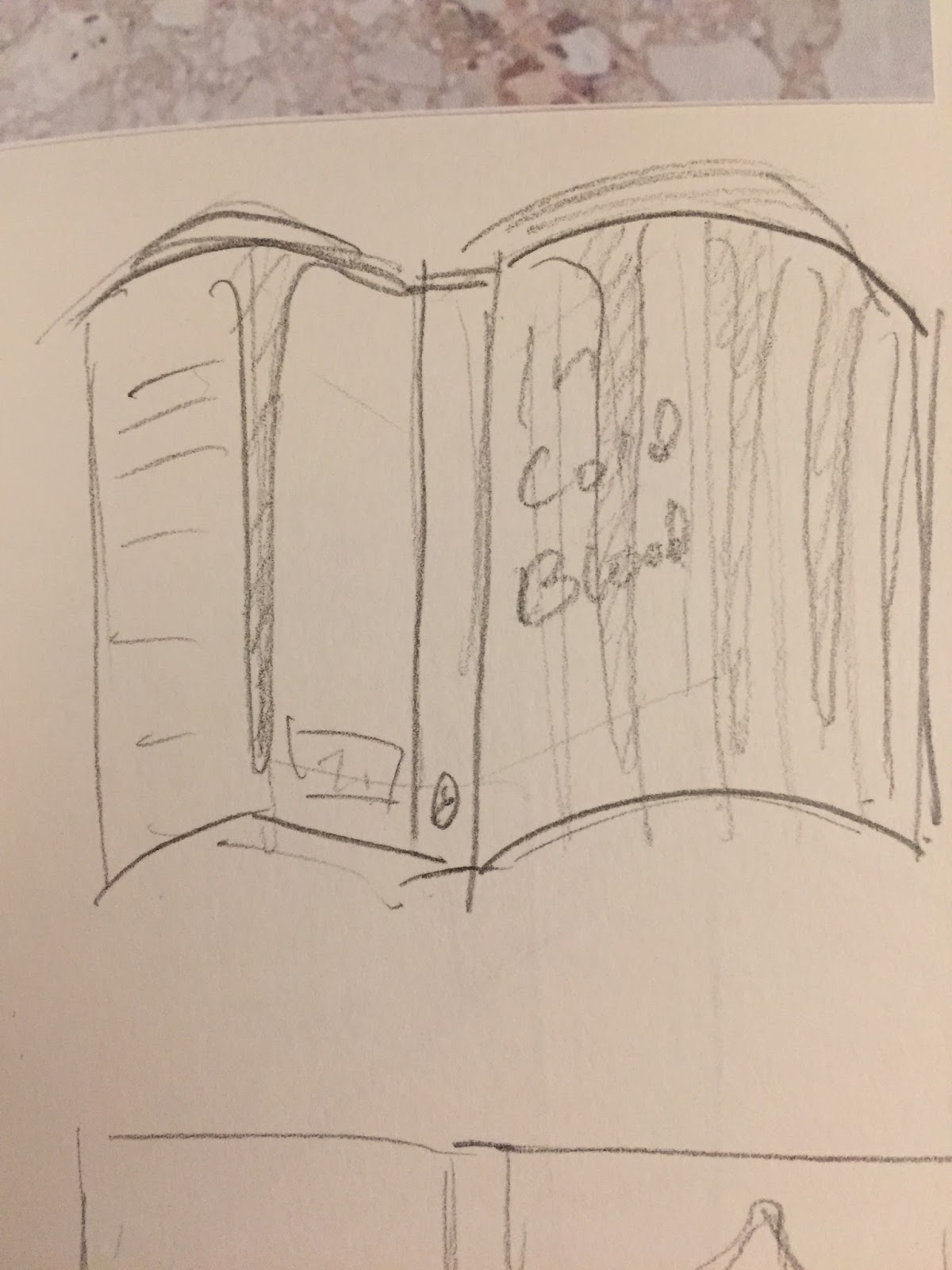
Brainstorm of the composition for the book cover.


I did more ink smearing so that I can use it to add more textures to the existing designs that I have made. 


Some spray paint experiment that I tried in order to get the similar smeary texture like the one on top.


A mock up for the book cover to show the composition of the words and the illustration. 


Putting them together in Photoshop:


I still think the design is a bit empty at this stage, and the back cover was not thought through. 
The typewriter font works well because of the noise texture outlining the letters. However, when I applied the same font for both front and back cover the design looks dull, so I will consider using another font for the back cover.

The spine of the book was inspired by the penguin classic design with three stripes. I do think that the design for the spine should be kept minimal because there is not much space for elaborate details.

There are a lot of considerations, but right now I have become oversaturated by this book cover design project. I've decided that I will not finish it up until it is close to the deadline day.

Responsive: Loopdeloop Cute - From ballerina to frog ballerina

I set to look out for a creative twist for my animation by doing more ballerina sketches with reference images from Pinterest where I also stumbled upon the name Anna Pavalova. She was a Russian prima ballerina from late 19th century, and also the first person who brought classical ballet on tour around the world. Her personality seems to be delicate and lady-like as I browse through her photos. There were a lot of photos of her hugging a swan and also sitting down, crossing her legs and wearing pearly accessories. Her personality has become really powerful and has become a stereotypical view to those who'd like to pursue ballet back then. 


I decided to work from this ballerina stereotype, and thought of what makes ballet fun. I remembered that Audrey Hepburn has give more energy to contemporary ballet in her movie Funny Face. Other than her occupation as an actress she is a trained ballet dancer, and incorporate ballet with other dance genres in a musical movie that people from all kinds of backgrounds can enjoy.


Some quotes from Audrey Hepburn that can inspire anyone to pick up dance:

After doing a bit of research on these two ballet personas, I decided to make a storyboard out of my idea. I was still thinking how to make it cute while having Audrey Hepburn's quotes at the back of my mind. So in the end,  I figured out that a frog ballerina would be a cute thing to animate (?).


WHY FROG?

Because Kermit the frog can do and be anything. Doo be doo be doo. Actually, I do not have a particular reason for this, it is just the first animal that comes to my mind.


Sketching frogs are fun! Also, frogs comes in any bold and striking colour which can contrast the colour of tutu. Probably that's the best reason that I can give: the striking colour of frogs makes ballet seems less feminine and it can make ballet more playful and appeal to a broad spectrum of audience.


Here are some of the initial frog designs. I like to keep it simple so there will be less details to draw when animating. When designing I thought of how to make the frog fits into the tutu. I tried to draw them differently, but it is definitely better to have it just wearing the tutu skirt without the top bit.


Sunday 8 January 2017

Responsive: In Cold Blood - Brainstorm

Who killed the Clutters?


The book tells a story about the case of the killings of the Clutter family in Holocomb, a village in Kansas. These two people are Perry Edward Smith and Richard Eugene Hickock, who both met at prison and was serving their parole at the time when they committed the crime. Capote vividly put together a humanising narrative which allows the reader to sympathise with the bad guys in the story. The plot of the story can be summarised by a quote: 'The American dream turning into the American nightmare'. 

The Clutter case research board

I wrote down some quotes that I think are significant to the story, and got carried away, so I ended up with this mess. (No you wouldn't want to read this page!) I can't find anything inspiring when going through the quotes because most of them are way too specific.

The Mess

Started on a fresh page, I tried to filter these messy information I have written down and make sense of the whole story. I ended up with this diagram, which you shouldn't read too because it is still a mess. Due to all these mess, I decided not to pursue a quote-based cover design. I think I dug in too deep into the matter, and I become overwhelmed by all the facts. 


This is not helping
I've learned my mistake and moved on from the quotes to creating colour board. I would probably not go with this colour board because the cool tone is not striking. Even worse, it makes the design looks unattractive. 

I like the contrast of black and white, but instead of blue I would probably use red or orange for the third colour.

Colour Board

Layouts 


I tried to incorporate Perry's Boots - being an evidence that is pivotal to the story - to some of the initial cover designs.


Here are some of the things that I came up with. I could not get creative with the boot and the footprint since I can only play around with the placement of these two objects. The boot kind of give away a spoiler to the audience too, so it is not a good idea to introduce the boot on the book cover.


Layouts with prison bars and corners. It is definitely hard to make a cover that does not spoil the story, but this is a more obvious spoiler so it does not give away as much specificity as Perry's boot. I like the design on the left, but I think it does not have the 'Penguin Books' look because the four lines representing the bars and the 4 dead Clutters seems to be distracting the buyer from the things that happens at the back of these lines.


At a few instances in the story, Capote compares the two convicts' behaviour and physique to that of reptiles. This could probably work as a cover design for In Cold Blood because reptiles are cold-blooded creatures. Readers could easily identify the title to the cover design, but it could be misleading, and not remain true to the story. For instance the reptilian tongue licking the farm house could be mislead the buyers to think of the story being more of a science fiction genres, probably of alien invasion or some kind of mutated form of life.


Some other scribbles of layouts mindlessly done.


Tried to incorporate blood stains in this design to symbolise the people who died in the story. At the back of the book is Perry's and Dick's while at the front are the blood of the 4 Clutters killed at the beginning of the story, arranged such that it looks like the arrangement of their family photo on the newspaper. This design is symbolic, but other than that I could not see its potential to be aesthetically developed.


FINALLY SOMETHING THAT I LIKE!


After spending a lot of time drafting through bad layouts, I finally came up with something worthwhile. In the end, I decided not to create a literal design, and take a more impression based approach to design the book cover.

I was unexpectedly inspired by what I had for breakfast this morning. Scrambled eggs! I definitely think that this idea is brilliant. Well, probably not to others, but it keeps me going for this project, so I would like to go with this idea.

Basically, the Clutter's case is like a cracked egg. The two criminals are 'broken' in someways before comitting the crime as they serve in prison. By killing the Clutters, they have 'broken' the comfort of living peacefully in the small village of Holocomb, and even causes paranoia throughout the whole Kansas area. The blood oozing out is a metaphor of the utter fate of both Perry and Dick, who died by being hanged at the gallows in the end. Like a cracked egg, once broken it is impossible to put it back together.

The next step to take is to decide on which medium to use for the book cover design. I thought of using textured background with simple iconic symbol just like the alternative film posters inspiration in the previous post.