Thursday 28 January 2016

Diedre: Action Poses Part 1

Finally, I am done with the first sheet of the action poses. I am gonna make another sheet of it because I really enjoy making it. Drawing the action poses made me explores Diedre's character even more, and I can see her character fit into the context of the story.

On the side note, I learnt that I am a visual learner since making Diedre's model earlier really helps me to I can visualise and draw her more consistently. It is acts as a visual aid which helps me familiarise with her construct.


Monday 25 January 2016

Diedre: Character Turnaround Line Test

A line test that I did for my character turnaround. I do not think it is good enough since the hair wobbles a lot, and the body volume is inconsistent. It is hard to keep the proportions consistent, but I guess I need practice drawing Diedre even more to make the turnaround better.


Set, Series, Sequence: Primary Research

These are the drawings that I did based on my retrospective research on the word 'helmet'. 

I drew the feeling that I got when I wear a helmet. It's like there is something that presses in the middle, near my jaw which makes me feel secure.


Hair steamer. I think of it as a magic helmet when I was little as it makes the users feel relaxed. 


Fish helmet to scare a smaller fish.


Camouflage helmet worn by soldiers.


Model Making Workshops

Last week, we had an induction on making a simple armature, in which I am supposed to make a model of a character that I pre-made. The first step that I did was drawing her profile and front view to scale and marking up the joints.
Side Skeleton

Front Skeleton

Next, I made the armature by connecting twisted wires. The length of the wire needed will be measured using a string from the scaled drawing. I feel that this is the most difficult process of making the armature because the steel wires are ductile. I failed my first attempt building the armature because some wire snaps as I tried to twist them, so I decided to start afresh. I succeeded on my second attempt to make the skeleton armature as I decided to use an aluminium wire which is more malleable than the first one.

 Failed Arnature
After the skeleton's done, I stuck up some styrofoam scraps to the armature to get the gist of her body shape. Also, I blend plasticine with artificial catalyst, and mould them to the limbs while leaving some space for the joints. Unfortunately, I don't have any picture for this process.

The fun bit of this induction task is putting on the details to the armature. I used scalpel to carve contours of the character which makes the end result looks smooth. I wet my fingers while sculpting to get rid of the finger markings.


Bald Diedre
This is the end product. I am really proud of the end results because it resembles the original design, with slight modifications as I don't have any red coloured plasticine.

Finalised Version

Thursday 21 January 2016

Set, Series, and Sequences: 3 Favourite Helmet Drawings

These are some of the images that I really like from the 24 drawings that I developed. I will use one of them and draw a storyboard based on it. I like these images because they are well-developed, and tell different stories about helmet which is based on my understanding of the subject matter after I did some observational drawing. 

1. 
Cat seen from a motorcyclist perspective
Medium: Marker

I imagined that this is what it will look like if I can fit a Go-Pro camera into a helmet. I like this because it shows unique perspective seen from a person wearing a helmet. The view in front of the person's eyes looks framed.


2.
Futuristic people wearing oxygen helmet
Media: Watercolour and ink

Like all post-modernist does, I draw futuristic dystopian illustration, and decided to put helmet into the illustration. As I was making this, I realised that there is a chance that people might have to wear helmet like astronauts in the future because the Earth's air is too polluted. 


3.
A man inside a jelly
Media: Watercolour and Ink

I was thinking about Jan Svankmajer's Dimensions of Dialogue which is rather creepy, so I decided to draw a bald guy's head in a jelly. I placed it in a very normal setting, a dining table, and makes it looks as normal as possible. I like the jelly pretty much protects the head from the outside world, although it can't totally conceal it just like how a helmet protects people's head.


Tuesday 19 January 2016

Captain Character Interim Crit

We had a little exhibition for the Captain Character brief, and we are encouraged to give comments and suggestions on other people's work in class. The critic session made me feel good about Diedre, and encouraged me to do some developmental work even more. Many of my friends commented that my work is original and well-developed. They also highlighted the colours that I applied to my character, Diedre, effectively brought out her personality. I think that the feedback that my classmates gave to me is useful to improve my creative practice as  they pointed out some steps in the creative process that I have missed out such as documentation of early development of work, such as researching and working the inspirations towards the final design. It is also a good reminder for me to create some of Diedre's key poses, which I haven't done yet.

Diedre: Character Rotation

I drew Diedre from various angles to get the jist of the volume of her body. Her bumps and curves can be clearly seen, and I started to appreciate her as a solid character. This stage of development is really useful for me if I were to animate or model her. 

I started by light-sketching the shape that she is based on, and give volume to them, then I added some sketchy details to the basic shapes, and then make a proper outline of Diedre. I decided to take this painstaking process of drawing because I tend to draw inconsistent proportions for different drawings.


Diedre

My character, Diedre is a lonely housewife. Her husband just died of a heart attack, and she can't get over his death. They were a sweet couple, and they are members of a rock and roll band which are currently still active. She is the singer of the band, while her husband was the bassist. She became bitter, quitted her GYM instructor job and binge ate junk food after her husband passed away, which makes her body out of shape. She does not want to upset herself even more by worrying about her saggy body so she developed a motto "Not fat, just saggy."to justify herself eating more junk food.

Diedre's T-Pose

Diedre's expressions are very limited considering that she is a bitter old lady. She is incapable of showing happy expression or even laughing. She can only give a forced smile, and depressing facial expression most of the time. As she was a GYM instructor, I reckon that it is important to show her stern and dominant personality, so I made some angry faces. Diedre is also capable of being shocked, especially after her husband's death as she develops a paranoia towards old age and dying.

   
Diedre's Expression Sheet


Monday 18 January 2016

Set, Series and Sequences: Iconic Helmets

I took a free Star Wars issue of an independent art magazine and cut an image of a Storm Troopers helmet and paste it on top of a body of a hipster-looking man sitting on a chair. The thought that I put into this collage is that present trends are usually revived from the past.

Storm Troopers from Star Wars

An observational drawing of Fashion designer Alexander McQueen's most celebrated collection 'Savage Beauty'. The shiny surface of the hair resembles the surface of the helmet. I define the shiny texture by drawing it with charcoal
Savage Beauty by Alexander McQueen

Kabuto noodles logo I thought of when I was hungry. The medium that I've chosen is fine coloured markers, and I decided to do some shadings with lines.


Kabuto Noodles Logo


Set, Series and Sequences: What If….?

I decided to move on from observational drawings, and ask myself some 'what if's question, and decided to draw my response to them. Some of my response are based on facts while others are based on what I've imagined them to be.


What if an astronaut lost his helmet in the outer space?


What if boxers uses soft protective gear/helmets in a boxing match?


What if a person run towards a tank that sprays out paint?


Friday 15 January 2016

History of Animation: Frank Armitage

Frank Armitage was a prolific background artist at Walt Disney Production Studio who did a lot of backgrounds for Disney classics like Sleeping Beauty and Jungle Book. I really think his minimalist, but detailed background drawings comes together with the nuance of the elaborately animated Disney film. Elaborate movement of Disney characters is balanced out by the minimalism in the backgrounds so that they do not clashes. Disney's animation strive to create relatable characters with expressive personalities and attitude, which conveys realism, and with realistic and detailed background the Disney film would look like renaissance painting. Another reason why Disney prefers to employ illustrator like Frank Armitage is because they have decorative style of drawings which can be used as murals in the Disney theme parks around the world.
Frank Armitage Illustration

Thursday 14 January 2016

History of Animation: Animating Prehistoric Creatures

Animation artists are keen towards exploring extinct prehistoric creatures especially the dinosaurs as they can play around with their imagination to give a realistic touch to an unreal setting where human living with the dinosaur. Gertie the Dinosaur is the first animated film with interactions between dinosaur and human protagonist directed by Windsor McKay in 1914. The animation is presented in a formal presentation set as McKay stood onstage in front of a whiteboard where the silent animation of Gertie is screened, he commands Gertie to do something while Gertie responds to his instructions. McKay took a perfectionist approach to animation as he is careful in handling even the slightest details of the animation. He is also the first animation artists to use key frames in an animation.


Stop-motion animation was used conventionally to conjure up the image of realistic dinosaur that interacts with actors in films. Usually the film of the stop-motion animation is either combined together with the life action footage or being projected into a miniature animation sets. This technique was made popular by Wills O'Brien who is a pioneer model animator in the King Kong movie in 1933. It is a tedious process which needs to be well planned before being filmed.


The vast technological advancement in the film and animation industry made it possible for computer-animated dinosaurs debuted in Steven Spielberg's Jurassic Park back in the 1990s. The use of CGI allows artists to apply intricate details and textures to the dinosaur's body that makes the dinosaur more dynamic, therefore, giving more realism to it, and ultimately give thrills to the audience with the film through groundbreaking visual effect. From these evidence, I think the development of technology in animation is to achieve realism based on concepts and imagination that is not real through the visual illusion of moving images.


History of Animation: The Rise of Modern Animation in America

Driven by the revolt against Disney in the 1941 due to exploitation of labour, Modern stylised animation becomes popular during the 1950s as the animation artists decided to move beyond the slapstick routines and “hurt gags”’ which is overused by American animated filmmakers back then. Many like-minded animation artists from the mainstream animation studio decided to quit work mainly because they realised that animation can be used to communicate beliefs just like design. The Modern Animation brings a lot of positive changes in the animation industry by encouraging freedom of expression, collaboration and style in animation.Warner Bros. is one of the studios that had successfully brought modern animation into television, dominating the market of Low Culture. Warner Bros. cartoons’ unique art style involves characteristic strokes of the animation artist, exaggeration of certain features in the character designs and minimalist background layout. It also have less elaborate movement as compared to Disney style animation avoiding excessive details which parallels the traits of Modernism art movement.


The Other Side: Applied Texture

 I choose a shot which displays the full body of both characters in my animation and by drawing the loop texture on a separate layer, which I did in black colour. 100% opacity did not worked well, there is an overlap between colour of the texture and the colour of the outline which makes it pretty jarring to look at. So, I decided to resolve this by playing around with the opacity so that there is a distinction between the texture and the outline of the characters.

At 70% opacity, the texture works better, but I am still not satisfied with it as the form of the characters are not as defined as I wanted it to be.

Opacity 70%
I decided to decrease the opacity to 54%, in which I achieved the effect that I wanted. The texture is still visible, but its colour does not clashes with the colour of the outline.

Opacity 54%

Monday 11 January 2016

The Other Side: Corrupted Photoshop File

I was about to finish animating this scene when I decided to save the animation which might be why it is corrupted. I tried to solve this problem, but it seems that nothing worked out and I have to re-do the animation from the beginning. One lesson that I learnt from this unfortunate incident is that it is a good practice to save multiple versions of file on many different places so that when one is corrupted, I don't have to painfully re-do it all over again. 


This also reminds me of the incident that occurred during the production of Toy Story 2 where someone accidentally messed up the animation file, which deleted nearly two-thirds of the whole animation. Luckily the production was saved as someone backed up the files in a personal computer. Despite al the benefits of animating digitally, the files of digital animation is highly vulnerable as it can be easily deleted, and when it is deleted there will be nothing left.

Article: How One Line of Text Nearly Killed Toy Story 2

Sunday 10 January 2016

History of Animation: Wartime Japanese Cartoon: Omochabako Series

The purpose of propaganda animation is to enforce a biased social perception towards certain group of people by showing the audience the bad side of those people which makes them fear and want to ostracise them. In most cases, characters represent a collective group of people such as in the Japanese propaganda series titled Omochabako where the evil Mickey Mouse is used to symbolises Americans. Aside of telling the audience that the Americans are evil, this animation reflects how the cartoonist looks down on the uniformity of the popular culture in America while comparing it to the richness of the Japanese culture. This can be implied from the use of forms in the character design; the Japanese are represented by diverse characters from folktales while the characters that represents Americans follows the form of Mickey. I think that there is a lot more information that can be inferred from suggestive propaganda animations like this depending on the audience's intellectual capability. While innocent children will only be able to see the entertainment value in them, educated people will be able to assimilate the message that the film is trying to convey by analysing the details being put in the film.


History of Animation: Limited Animation

Limited animation is a method invented to cut down production cost and production time for commercial animation. It involves using template cels for recurring movements, drawing each part of the character bodies on different cels, smearing, reversing cels and other ways which can be used to outsmart the tedious classic frame by frame technique developed by Walt Disney. This method was widely used by animators in the 1960s in the production of the Saturday-morning cartoons in America, following the success of Gerald McBoing-Boing an animated short produced by United Productions of America (UPA) done in twos. There is a paradigm shift towards limited animation because it is more economical, and it does not reduces the quality of animation as much. It also influences the invention of animation softwares used by animators in the present.

Personally, I think limited animation makes animating easier and faster which balances out workload of the animators working on animated TV series. I use this method for the animation that I am currently working on because I do not have the luxury of time to do it, and I find it satisfying because it involves creativity to figure out a way to make the animation work well by reusing frames.


The Other Side: Textures

I made some textures to be applied to the little girl, the shadow and some parts of the background. Most of them are based on the mark makings from Tim Burton's illustration, but I want to be more creative in the development so I decided to observe my surroundings and came up with texture 5 and 10. Texture 5 is the close up of the knit patterns of the sweater that my tutor wore, while texture 10 is how I've seen it from afar. The details observed will change relative to which angle I view it from and how far apart I am from the subject.

Out of all the scruffy textures that I came up with, I think the texture 4 is most suitable for my animation because it involves less details and does not necessarily needs to be neat and consistent so I can make it quickly.


Possible Textures for Animation

The Other Side: Inspiration -- 1000 Shadows Project

Source:

An awesome installation project that my friend told me to look for as I told her about my project. Baglione started to paint on the walls of an abandoned psychiatric hospital, and got inspired to start the 1000 Shadow Project. I'm especially fond of the fluid form of Bagoline's shadows and the outlines of the ribcage of the shadow which makes me keen to add more details on the shadow's body. Unfortunately, I have settled with my character designs when I discovered this so I decided to keep it as it is.


The Other Side: Inspiration -- Peter Pan's Naughty Shadow

This scene shows a really fun impersonation of a shadow which are detached from Peter's body. 


It influence me to make my animation a little bit light-hearted despite the dark theme by making the shadow plays around with the litte girl who is running away from him. Through this interactions, the viewers can also understand the suspense that people feel when they are being haunted by their fears.


The Other Side: Inspiration -- Vincent

The concept of this animation is inspired by this stop motion animation by Tim Burton which explores Vincent's dark thoughts through a poetic narration. As a 7 years old, Vincent looks like a goody two shoes on the outside but he also has his own evil. In my animation, I decided to make a response to the inevitable process of sinking into those darker thoughts. The little girl in my animation represents innocence while the shadow represents the evil within her. The flow of the animation explains that retaining sanity and fear from dark thoughts will let the shadow of oneself grow and consume them even more.


Saturday 9 January 2016

The Other Side: Timing and Spacing

I was animating a bus decelerating when I realised that it is easier to be done when the spacing between positions are marked up by a symbol like crosses beforehand. Planning the animation before doing it is really important as it keeps me on track of the what to draw, and makes the process even faster. 


Marking Positions


I fixed the change of positions to every 8 frames while decreasing the distance of the change in position over time. Consistency of timing will give the effect of the bus decelerating.


Timing

Monday 4 January 2016

The Other Side: Animatics

I made an animatic for the story that I am working on for this project and try to put sound effects. I found making animatic really helpful for me to plan the timing for each scenes. The comments on this animatic are generally positive as it shows clear animation style and also well-timed. However, in my opinion, timing is a problem in this animatic. 

Firstly, the timing is too quick because there are so much actions going on in such a short span of time. So, I will try to simplify some scenes in the actual animation so as to give more time for the scenes which are more important to the story, and give more time for the audience to understand what is going on in the story.

Secondly, I received a suggestion to show anticipation from the background music. I think it will be better if the timing of the animation is worked based on the background music, which I will try to work on as I animate.


Sunday 3 January 2016

Set, Series and Sequences: Helmet and Culture

There are many kinds of helmet which visually represents cultures or rather stereotypes inherent in different cultures. Despite the main purpose of helmet as a protective headgear, not all of them are used for protection. Some of them are worn in celebratory events, while others are used as a medium for entertainment, social activism and many other purposes. 

The nordic helmets worn as protective head gears by the Vikings in the late 11th century. It justifies the stereotype of the Vikings' barbaric nature. For instance, the nose guard implies that the Vikings war are usually close range and violent combat. 

Nordic Helmet

Custodian helmets is a cultural heritage of police in the United Kingdom. They used to be worn by police in patrol duties, but recently they are deemed to be cumbersome. So, they are only used for ceremonial purpose in the present. The medium that I chose is white colour pencil on a black paper. The black background represents the mourning of many police officers as the custodian helmet has become a relic of the past.

Custodian Helmet

The Vespa helmet symbolises of the Mod culture originated from London in the 1960s. It also marks the rise of hedonistic pursuit post World War II as people started to care about fashion, brands and music. I unintentionally made rough and bold lines with charcoal (which smudges in the end because it is too thick), but I think this treatment suits the illustration as it represents the crude ideology of youths back in the 1960s which is highly influenced by superficial commercialised trends.

Classic Vespa Helmet in Mod Culture

Another style icon associated with the word 'helmet' is helmet hair, also known as the Bouffants. This hairstyle is really popular among American women in the 1960s. I use bright colours to represent the gayness of the fashion style at that point of time. I drew the rollers to fill the background as I imagine how many rollers does these women put on their hair to make it puffy.


1960s Helmet Hairstyle

Oculus Rift is the current cutting edge gadgets which offers the virtual reality experience that people has been dreaming of. The strap that goes over the head of the wearer and the hard material that it is made of makes it fit into my own definition of a helmet. This helmet serves as a form of entertainment for the current generation of gamers. The media used is markers and watercolours. The repetitive patterns on the background reflects the electromagnetic waves travelling into the people's mind and produces imagery as they are processed by the human brain.

Virtual Reality Headgear in Gaming Culture

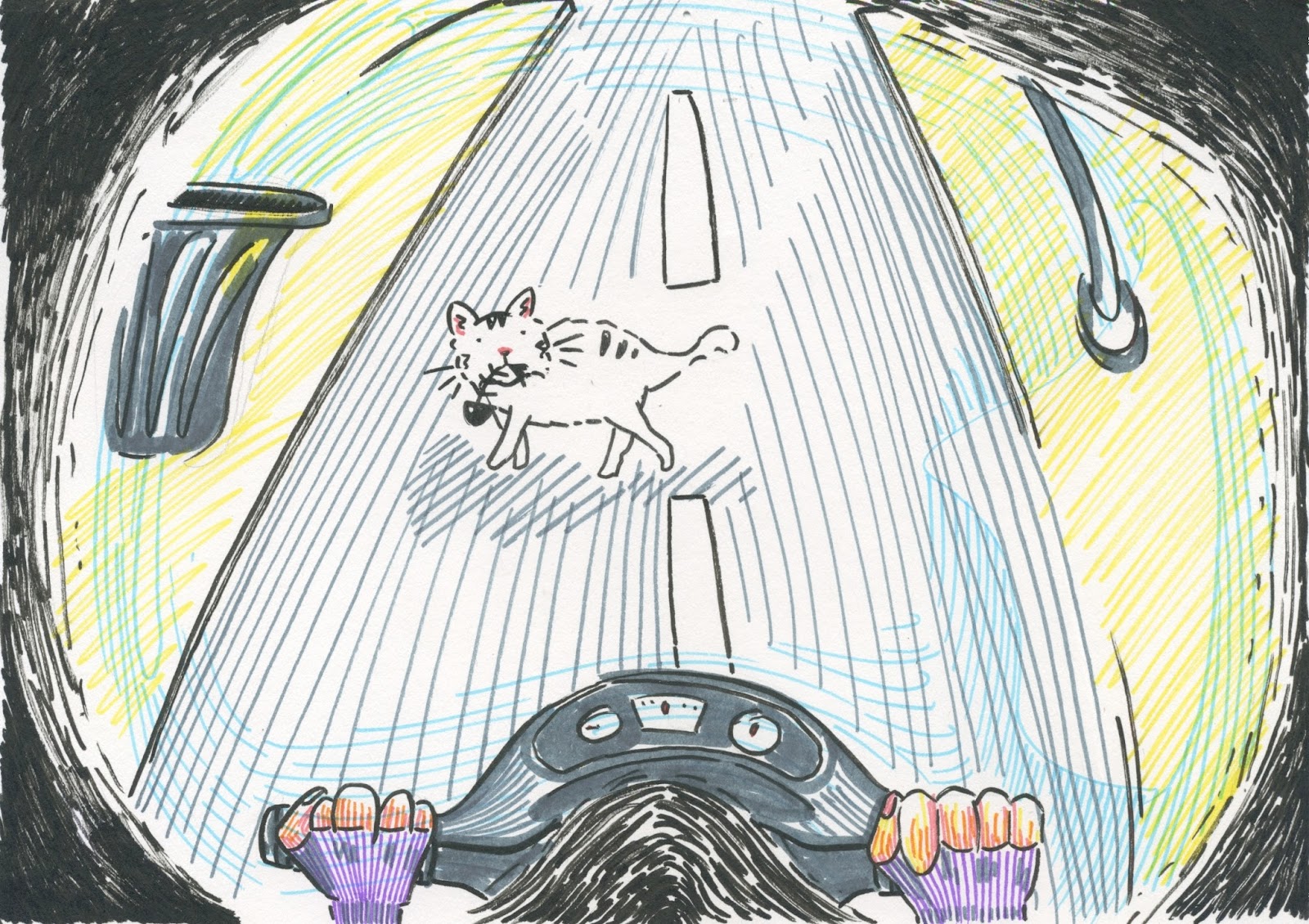
An illustration based on the picture I found on Pinterest as I look up for Indonesian motorbike gang. Indonesian motorbike gang are infamous for racing in the city at night. Most of the members comes from the lower middle class Indonesians. Despite being an outlaw, this gang is surprisingly active in green campaigns. The members of the gang wear pot helmets and cycle around the city to promote reforestation. The medium that I use is marker, and I use colour markers to engage the audience on the form of social activism that the motorbike gang is involved in.

Motorcycle Gang  Promoting Green Campaign


Set,Series and Sequences: Definition of Helmet

After exploring the evolution of american football helmet, I think that it is worthwhile to create some set of images which depicts the word 'helmet'. 

I made a collage of the side view of a helmet to show my perception of helmets. They are mostly seen from their sides and the glass part of it reflects what is ahead of someone who wears it. The paper cut-outs is an appropriate medium because it helps me define the shape of a helmet without using any outlines.


After a further research, I discovered that there are also helmet plant which are lethally poisonous. The shape of its flowers resembles the shape of knight's helmet. The medium that I use is 2B pencil on watercolour paper. Using pencil on the watercolour paper creates textures on the drawing, and it makes the stems of the plants look realistic.