Saturday, 29 October 2016

Telling Tales: Week 4 - First Crit and Refined Animatic

Concept Art


I did a concept art painting for the crit session last Tuesday. I did this in order to compile the things that I have researched last week which is the colour palette and the interior design of the teepee. The colour palette for the Shaman works well, but it does not look right when combined with the colour palette I made for Totsi most probably because the colors that I picked for Totsi is too light. Hence, Totsi does not stood out with the intial colour palette. To solve this problem, I decided to apply a bolder blue on her outfit so that the juxtaposition between the Shaman and her is more obvious.

Concept Painting

While looking for inspiration for the painting, I browsed through The Art of Big Hero 6 trying to look for a simple style of digital painting. I am intrigued by the paintings done by Victoria Ying because they are clean and simply done in block colours, without smooth blending. She often uses textured brush which gives a nice variation to the painting. I tried to apply these techniques on my painting with a set of brush that I have gotten from a friend.

Artist Reference: Victoria Ying


Final models of the characters made by Dan


While I did not do any of the modelling, I think featuring what Dan have done on my blog is cool because he really did an awesome job on modelling the characters, and these will make my blog beautiful :)

Working based on our strength has set us an extra time to animate, so that we will have more time to experiment with the movements of the character.


Animatic


During the crit session, most of the comments are directed upon the animatic for being unclear. This happen because we are too lazy to draw a polished animatic and also because of our misunderstanding that animatic is just storyboard with sound. The real animatic should be close to the final look, showing camera movements and every change of action. So, here goes the now cleaned up animatic. Enjoy!


 As you can see, there are some changes in style. I am not sure whether this is acceptable, but here is my reasoning:


The first drawing style reflects my attempt to compensate the unsatisfying digital concept art painting. colours are useful to establish the scene. I think colour script is rather redundant for a 1 minute long animation, so I decided to stick with the same colour palette in this animation. Instead, I've considered varying the intensity of light emitted by the fire to create suspense in the narrative.

Coloured
As soon as I identified what is the important considerations, I put less detail on the animatic, so that I can quickly finish the animatic.

Monochrome
Learned that this is the most basic method to draw animatic in the industry as I grew tired of drawing, and look for a faster way to draw the animatic. I watched some animatics from Avatar: The Last Air Bender on YouTube and this is how they do all the animatic throughout an episode. 

Sketchy 


Saturday, 22 October 2016

Telling Tales: Week 3 - Visual Development

Moodboard for Character


Found a book about native american myths and folklore, and patch up a quick moodboard, and chose the colours that fits for the characters. Totsi's colour palette is taken from the meaning of her name, moccassin which is the rattan shoes that native american people wear, and kachina dolls.

Meanwhile, I pick some of the colours from the totem pole for the Shaman because the totem carvings are symbollic to the sacred beasts that the Native American people worship, such that the colour choices represents other-worldliness, supernatural power and wisdom. The background's colour pallete will be the same as the shaman's simply to indicate that he owns the place. The spirits that comes out will be that of Totsi's.


Medium

Dan and I had a discussion about the medium that we are supposed to use for the animation. We decided to go for the idea of mixing paint on glass animation and 3D animation, and also about painting traditionally the UV texture on the sculpted CGI model to achieve a more natural aesthetic in the final piece.

Other than that, I have tried a bit of oil pastel to get some different mark making style, such as the rough textures from chalk drawings and colour blending which I am not really good at.

Pros of Oil Pastel: childhood nostalgia, getting familliar with the medium.
Cons of Oil Pastel: limited colour choice, and can't mix colours like when using paints.

I decided not to use them, but will try acrylic painted backgrounds and UVs for the CGI models.


Background Design

I made a compilation of pictures of the interiors of the teepee since I am not sure of how big it actually is.They are mostly rare photos and some traditional native american paintings that I find on the Internet. Going through this visual research has helped me to understand the size of regular teepees better. There is actually not much space to move around as i thought it would be inside a teepee. Having a small space could mean a good thing for the animation as it takes less time for Totsi to dash to the middle of the teepee from the entrance than what I expected.


A detailed illustration of floor plan that I came up with, showing the interior and placement of props inside the Shaman's teepee. I was inspired to make a floor plan as I was reading Hans Bacher's book titled Dream Worlds, in which he explains the importance of planning out the set and having a space that facilitate characters for their actions.


Some sketches to explore possible placement of the characters and the props in the background.


Thursday, 20 October 2016

Telling Tales: Week 2 - Final Look and Storyboard


I'm behind for this weekly production diary as I'm not feeling well at the end of the week. I also felt guilty for not being productive last week, but I had enough rest, and now I feel much better. What I did last week was drawing the final look of the character design. 

On the top left, I still have not decided on which outfit is best for Totsi, and whether her feathers stands up or flops down. In the end, I decided to take the parts that I like the most from those three drawings and keep the feathers flopping down as they are held by her cape. The bottom bit of the sketchbook shows the final design for Totsi. I really like the design, and I kind of realised that she looks like a little chick, so I came up with a backstory which explains how Totsi wears her cape up to her head. Since she is really small, she has a fear of being preyed by huge carnivorous birds, and she thinks that by covering her head with the cape she will look like a miniature teepee and keep her away from the threat. 

Drawing the turnaround will make the modelling process more convenient for Dan as he can look at the design from various angles. The expression sheet are made after I did the storyboard with Dan, such that the expressions drawn are only those that will appear on the actual animation. I would like to spend more time developing Totsi if I have time to do so, but for now I think it is better to move on to develop the overall production design because I want to get it done for the preproduction crit on the 25th.

Totsi's Character Sheet

For our group discussion this week, we finalised our storyboard. Dan has sketched out some of the scenes from the middle towards the end of the story, but he could not think of a strong ending. Since we know the sequence of events that leads to the climax, we use the sticky notes method to draw out some of the scenes that we will definitely include. It speeds up the process of storyboarding as we can draw two scenes at a time, and we can start with the scenes that we are certain of and add more scenes to make a sensible flow of the storyline.

This is how the final storyboard looks like. We came to an agreement that camera movements are to be kept in a minimum as the objective of the animation is for the characters to deliver 'the message' to the audience. Lighting is mostly direct indoor lighting from the hearth at the center of the teepee. For the following week, I will do a further research on how big a teepee actually is as right now the mental image that I have of a teepee is an enormous conical hut which can fit a whole family of the Native American tribes. The animation is a pantomime, in which there is no dialogue between characters, they communicate through exaggerated gestures. We have not discussed about what background sounds that we want to put on, but in my opinion, sound effects will suffice since a melodic piece will distract the audience from the real interaction that is going on in the animation.


Storyboard


Sunday, 9 October 2016

Telling Tales: Week 1 - Project Brainstorming

I decided to partner up with Dan on this project because I want to learn to animate on Maya and Dan wants to improve on his pre-production work. So far, it has gone well in terms of brainstorming, and having a partner speeds up my decision making process, especially with this inventive idea of choosing the title by coin tossing. We ended up with the title 'The Message'. 

On the right hand side of the image below is a brainstorming page that I did after reviewing what I've discussed with my partner. Both of us like the idea of incorporating the primitive way of passing down messages through smoke signals, and through association we chose the native American culture to be the theme of our animation. We are especially interested in their religious belief, but decided to focus on researching shamanic practice. 

From left to right: Shamanic practice research and brainstorming page

List of character's states and motives based on superficial interpretation that has helped us to decide on the rough storyline. This serves as a guideline to develop the project, and hopefully the finalised idea will be better.

Story brainstorming and character roughs
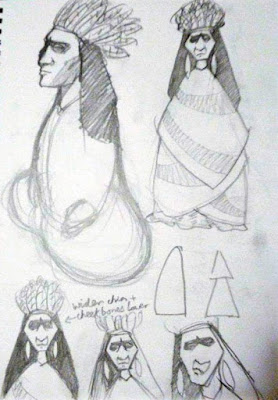
Dan's focal character is the Shaman, and that's how he looks like. Not so much of an energetic character. We are planning to make him stay put throughout the animation while performing a ritual.
He is sly because he does not understand what kind of ritual he is doing, but tries to act like a professional when performing the ritual.

The shaman final design
 Initial designs of the kid character before doing secondary research. They all look plain and similar to the designs in Disney's Pocahontas mainly because of the hairstyle.


Not satisfied with the first few sketches, I tried to put on headgears on the characters. Not quite the look that I am looking for although they look cool. These designs are more suitable for adolescent characters. Also, their facial features are more refined than those of a kid. I remembered that during Visual Language, we have to design a character based on basics shapes. So, I drew out a triangular shaped outline and tried to fill up its inside. I like the shapes, and someone pointed out that the triangular shape reminds him of a Tee Pee, which is the hut where the Indians live in.


I am already satisfied with the design inspired by Tee Pee, but I tried to look into something else such as Kachina dolls and the outfits that the Indian kids wear in the early 20th century. I choose to look at the 20th century simply because the photo references that I found are mostly taken in that period.


Designs inspired by Kachina dolls and some of Native American children's traditional outfits. I figured out the sloppy look for the character might spice up the element of surprise in the storyline. With the sloppy look, the audience will have low expectation from the kid, but they will be surprised that she can perform complex religious ritual that only the shaman can perform.


No.1,2 and 4: Developed stuck-on-cape design. I like design 1 the most, design 2 is a cleaner version of design 1 with slight changes.

No. 3: Carricature of a boy based on a reference image.