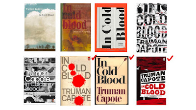
- Re-design a cover for In Cold Blood: A True Account of a Multiple Murder and Its Consequences by Truman Capote.
- Bold, maybe even shocking cover design
- Design template: B format, 198mm high x 129mm wide, spine width 20mm, incorporating all the penguin branding and all additional elements such as the bar code.
The challenge
- Striking cover design that is well executed, has an imaginative concept and clearly places the book on its market
- Consider physical and digital publications
- Imaginative concept and original interpretation of the brief
- Strong use of typography
- (Audience) Appeal to a contemporary readership & show a good understanding of the marketplaces
- Have a point of difference from the past and current book covers it is competing against
Background information of the book
- Regarded as the pioneer work in the true crime genre
- Startling
- True account of a gruesome crime and a skilfully researched piece of journalism
- Brilliantly imagined
- The most gripping of thrillers
The judges
- John Hamilton - Art Director, Penguin General: specialised in illustration, 'the driving force behind dropping the orange spines from the majority of Penguin fiction', responsible for art-directing Penguin's hardback imprints, Viking, Hamish Hamilton, Michael Joseph, Fig Tree and Penguin Ireland, invited seventy designers, artists and illustrators to create one cover each for Penguin's Seventieth Birthday Campaign.
- Joanna Prior - Managing Director, Penguin General Books: book cover design and some award-winning marketing campaigns in the marketplace, run Penguin's art committee which curates the typography art at Penguin's offices at 80 Strand, responsible for publishing prize winners and bestsellers (Nick Hornby, Zadie Smith, Anthony Beevor, John le Carre and Colm Toibin)
- Jim Soddart - Art Director, Penguin Press: Used to design record and CD covers, and also book covers, redesign and rebranding of Penguin Classics, Penguin Modern Classics and Pelican books, designing and art-directing covers for Penguin's Allen Lane hardback imprint the Particular Books imprint and penguin non-fiction paperbacks.
Reason for interest
The movie adaptation from 1967 has made a strong impression on me, and doing this brief will give me a reason to read the book without feeling guilty. The theme of 'gruesome crime' excites me. I also want to find some other things to do rather than just animating, and I think that creating a book cover allows me to distract myself from the rigorous animating process which has gotten into my nerves lately, and get to try out some other method of visually communicating idea. By choosing this brief, I would also have some other benefits as an animator as I will be analysing the storyline and identifying the semiotics of the book, hence giving me the opportunity to develop the profundity of the content of my animation in the future.
Useful pointers
Source: Under the Covers - Telegraph
'The successful imprint combines the best of the huge with the best of the small, the sales and marketing machine of the juggernaut company combined with the boutique (awful word) sensitivity of a small editorial, design and publicity team where the writer and the agent will know everyone involved and the taste and sensibilities of the team.
One of the extraordinary things about publishing - as both the publishers and the bookselling chains become larger and larger - is what a personal business it is. It is driven by personality: the personality of the book itself, the conviction of the editor buying the book, who in turn translates that into advocacy by sales, marketing, publicity and rights departments, which will then be passed on to booksellers or foreign publishers or even film moguls.'
Past cover designs
I placed a red ticks on each of the designs that I like.
 |
| First and personal favourite design by S. Neil Fujita |
Fujita's artwork is characterised by well-thought shapes, composition and colour, with modern aesthetic. He is well-known for his book cover and record designs. He also does some editorial illustration for magazines. One thing that I like about the book cover is the simplicity of design, the use of colour and the use of symbolic representation which concisely summarised Fujita's personal insight on the narrative.
Cover design by Nathan Burton
Scratchy aesthetic, the use of colour red, black and white gives of the feeling of tension. Has the contemporary look.
Made by the guy who also designed the book cover of the classic Clockwork Orange, David Pelham. The design is spot on with the four blood splatter representing the four murdered victims.
'While I find it quite troubling that such violent events should be narrated so beautifully, nevertheless this is a potent cover that tells the truth, in that judging this book by its cover will not disappoint. It sold extremely well. When considering the cover I noticed that the typographical characters making up the title and author’s name ‘In Cold Blood, Truman Capote’ between them contained four ‘o’s; so obviously I substituted each ‘o’ for a blood spot, one for each of the four victims.'


No comments:
Post a Comment