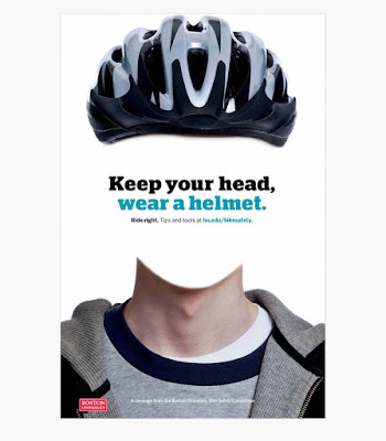
A set of safety campaign posters by Boston University which is aimed for students to wear their helmet when riding their bikes. The wacky design makes a lasting impression of it to the audience, and is an effective reminder for them. There is no order to this set of posters, but the standardised text and imagery allows the people who see the posters to identify them as a set of designs that communicates the same message. They perceive it in such way because, more often than not, people have the habit of stereotyping.
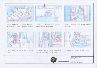
These posters inspires the story idea for my finalised storyboard, such that they are reinforce each other to convey the safety reminder to wear helmet when riding bikes. I decided to go with the idea of a biker chased by a police for not wearing helmet, while adding some comedic element to the plot.


No comments:
Post a Comment